# Hyblock Academy

## Get Started

Start exploring Hyblock metrics below, or see Hyblock tools in a live environment on [Hyblock Terminal](https://hyblockcapital.com/terminal). [<br>](https://academy.glassnode.com/concepts/utxo)

{% content-ref url="/pages/vQftIwmYCPbhuBehYQ5z" %}
[Hyblock Terminal v2.0](/hyblock-terminal-v2.0)
{% endcontent-ref %}


# Hyblock Terminal v2.0

Welcome to the tutorial for our newly released Hyblock Terminal, your comprehensive trading analytics platform. We are excited to introduce you to the powerful features that make Hyblock the ultimate tool for crypto market analysis. This guide will walk you through the key functionalities and enhancements of our new terminal.

### Introduction to the Hyblock Terminal

The Hyblock Terminal is designed to consolidate all your trading analytics needs into a single, user-friendly interface. Previously, our tools were scattered across different tabs in your browser, making it cumbersome to switch between various analytics and indicators. You can now access everything you need on a single screen using widgets. This streamlined approach ensures you have a clear and organized view of all your analytics.&#x20;

**Easy Navigation**

The hamburger menu, located at the top left of the screen, provides easy access to all the tools we offer. Simply click the menu to see a list of available tools and select the ones you need for your analysis.&#x20;

**Multiple Instances of the Same Widget**&#x20;

You can add the same widget multiple times to your dashboard. This feature allows you to view different data sets or apply various settings to the same type of widget, enhancing your ability to perform comparative analyses.&#x20;

**Flexible Widget Management**

Your dashboard can accommodate up to 12 widgets simultaneously. This capacity ensures that you can have a comprehensive view of multiple data points without feeling overwhelmed. Widgets can be resized, moved around, maximized, or minimized according to your preference. This flexibility allows you to create a dashboard layout that best suits your workflow and ensures that the most critical information is always prominently displayed.

{% embed url="<https://youtu.be/-NgLMyabZoU>" %}
Introduction to Hyblock Terminal
{% endembed %}

### Configuring and Using Widgets

**Selecting a Tool**\
Choose the tool you wish to use from the menu. After selecting a tool, a popup will appear allowing you to configure the settings for your widget. Here’s how to set it up.\
\
**Configuring Your Widget**\
Type of Graph: Depending on the selected widget, choose the specific type of graph you want to create.

* For Heatmap: Select from Liquidation, Open Interest, or Net Longs/Shorts.
* For Data Explorer: Choose from various statistical charts like histograms, screeners, spaghetti graphs, etc.

Select Tickers: We support over 400+ tickers. Use the search bar to quickly find specific tickers you are interested in.\
\
Lookback Period: Select the desired time frame for your data. Options include:

* Daily
* Weekly
* Monthly
* Custom periods

**Running the Widget**\
Once you have configured the settings to your preference, click on the "Run" button. The chart will be created based on your configuration and will appear on your dashboard.\
\
**Editing Widget Settings**\
If you need to make changes to your widget settings, simply click on the title of the graph. This will bring you back to the same configuration popup, allowing you to adjust your settings as needed.&#x20;

{% embed url="<https://youtu.be/Q0l2i9uZflA>" %}
Configuring and Using Widgets
{% endembed %}

### Customizing Chart Settings for Widgets

**Accessing Chart Settings**\
Each widget has its own unique chart settings based on the type of graph created. To access these settings, click on the settings button located at the top right corner of the widget. By customizing the chart settings, you can enhance the clarity and relevance of the data displayed in each widget\
\
**Widget-Specific Options**\
Depending on the widget you have created, you will have a different set of options available. Here are some examples:

* Liquidation Level Graphs:&#x20;
  * Leverage Amounts: Select or deselect different leverage amounts to filter the data.
  * Granularity: Adjust the level of detail displayed in the graph.
* Heatmaps & Screeners:&#x20;
  * Min/Max Color Scaling Tool: Use this tool to reduce noise and focus on specific ranges within the scale. This feature is especially useful for highlighting significant data points.
* All Widgets:&#x20;
  * Color Palette: Change the color palette of the widget to suit your preference or to make the data more readable.

**Applying Settings**\
After adjusting the settings, click the "Apply" button to save your changes. The widget will update to reflect the new settings, providing you with a customized view of your data.&#x20;

**Restoring Default Settings**\
If you wish to revert to the default settings, simply click on the "Restore to Default" button. This will reset the widget to its original configuration.

{% embed url="<https://youtu.be/h9uTlDfRsT8>" %}
Customizing Chart Settings for Widgets
{% endembed %}

### Utilizing the Data Explorer Widget

With the Data Explorer widget, you can you can harness the full potential of Hyblock's extensive data and create insightful visualizations tailored to your specific analytical needs. This flexibility enables you to slice and dice the data according to market trends and make strategic trading decisions.

**Selecting View Type**\
After selecting a graph type, you can choose between two primary view options:

* View Multiple Coins Across One Indicator: This option allows you to analyze how different coins perform against a single indicator.
* View Multiple Indicators Across One Coin: This option enables you to compare various indicators for a single coin.

**Example: Creating a Histogram**\
In the video, we demonstrate how to create a histogram using the Data Explorer widget. Here are the steps we followed:

* **View Multiple Indicators Across One Coin:** We chose to view the Global Accounts Long Percentage, Whale vs Retail Delta, and Average Leverage Used Delta for just BTCUSDT.
* The histogram provided a visual representation of these indicators, allowing us to analyze the data effectively.

**Changing the View**\
Next, we quickly opened another histogram to demonstrate the flexibility of the widget:

* **Viewing Multiple Coins Across One Indicator:** We selected ETH, AAVE, and SOL to compare their performance for just a single indicator, Global Accounts Long Percentage.
* By changing the dropdown setting, we were able to generate a completely different view of the data.

**Emphasizing Customization**\
The ability to easily switch between different views by adjusting a simple dropdown setting adds significant customization to the Hyblock Terminal. With over 400+ tickers and numerous indicators available, this functionality allows users to digest information quickly and make informed decisions.<br>

{% embed url="<https://youtu.be/uYWAdPdqiiY>" %}
Utilizing the Data Explorer Widget
{% endembed %}

The Data Explorer widget in the Hyblock Terminal offers a variety of powerful graph types that allow you to visualize and analyze data in multiple ways. These diverse graph types make the widget a versatile and powerful tool for market analysis.

**Screener** \
The Screener allows you to scan the market for coins or indicators and visualize the results via a heatmap. This tool helps you understand how each row has been changing over a selected lookback period and identify current outliers. By providing a quick visual overview, the Screener helps you spot trends and anomalies in the market, making it easier to decide where to focus your attention.&#x20;

**Histogram** \
Histograms are a powerful way to build probability distributions across various coins and indicators. By plotting the frequency of different values, histograms help you understand the underlying distribution of data, identify central tendencies, and spot outliers. \
\
**Spaghetti Graph** \
Spaghetti graphs are invaluable for tracking the performance of multiple variables over time. In the Hyblock Terminal, spaghetti graphs allow you to visualize the performance of multiple coins or indicators simultaneously, making it easy to compare trends. Each line represents a different variable, and the global average line is included to provide overall market context. This type of graph is perfect for identifying patterns and understanding the broader market dynamics. \
\
**Correlation Matrix**\
Correlation matrices are essential for understanding the relationships between different coins or indicators. By displaying the correlation coefficients between pairs of variables, these matrices help you identify which variables move together and which do not. \
\
**Profiles**\
Profiles in the Hyblock Terminal take the concept of volume profile analysis to the next level by incorporating additional data such as volume delta, open interest, and liquidations. This type of graph helps you understand the distribution of trading activity over different price levels, providing insights into where significant buying and selling pressures exist.

{% embed url="<https://youtu.be/ydD-CysyH3c>" %}

The dashboard is designed to give you a clear and structured view of all your widgets, ensuring that you can analyze data effectively. By utilizing all the features, you can ensure that your dashboard is always well-organized and that your preferred configurations are readily accessible.\
\
**Organizing Your Dashboard with the Smart Grid**\
If your widgets are not organized correctly, you can quickly tidy up your dashboard using the "Smart Grid" feature. Here’s how:

* **Smart Grid Button:** Located at the top right corner of the dashboard.
* Functionality: Clicking this button will snap all your widgets into a clean grid layout, where each row contains three widgets of the same size. This ensures a neat and organized workspace, making it easier to view and compare your data.

**Saving Individual Widgets**\
To preserve the settings and configuration of each widget, you can save them individually. Here’s the process:

* **Save Icon:** Found at the top right corner of each widget.
* Clicking this icon saves the widget along with its current settings, allowing you to easily reload it later without having to reconfigure.

**Saving Your Entire Dashboard**\
You can save your entire dashboard to maintain a specific layout and configuration of multiple widgets. Here’s how:

* Save Icon: Located at the top right corner of the workspace.
* Clicking this icon saves the current state of your entire dashboard, including all the widgets and their settings. This feature is particularly useful when you have a specific setup that you frequently use and want to preserve.

**Loading Saved Widgets and Dashboards**\
After saving, you can load a new or previously saved dashboard at any time. Here’s the process:

* **Load Option:** Accessible through the save icon’s dropdown menu at the top right corner of the workspace. Within this dropdown, you will see options to load individual saved widgets or entire dashboards.

{% embed url="<https://youtu.be/pxWcF2HxAMc>" %}


# Product Announcements

A list of changelog / new releases / product updates


# Trade to access Free Hyblock

Big news! Hyblock is now partnered with Bybit, and we're offering you free access to our analytics services. Here's how it works: trade on Bybit using our referral link, and you can unlock Hyblock's premium analytics at no extra cost.&#x20;

*How to Claim Your Free Access:*

1. Sign Up: Use our referral link \[<https://www.bybit.com/invite?ref=3OQ3JP>] to create your Bybit account.
2. Trade as Usual: Keep trading on Bybit. Hit the monthly trading volume target, and you'll get Hyblock analytics for free.
3. Join the [discord community](https://discord.gg/Tg4pbdJwXN) and open a ticket via ⁠#support-tickets channel. Then share details on ref account. We will track and upgrade end of month.

#### Volume Targets for New Users:&#x20;

New User (Basic Plan) upgrading to Advanced Monthly: $1million volume / month&#x20;

New User (Basic Plan) upgrading to Professional Monthly: $6million volume / month&#x20;

#### Volume Targets for Existing Users:&#x20;

Existing User (Advanced) upgrading to Professional Monthly: $4million volume / month&#x20;

This partnership now enables users to leverage their trading volume on Bybit to gain free access to the new Hyblock Terminal. All parties benefit from this partnership.&#x20;


# Release v1.1

**This update includes a complete redesign of our 10+ products, new indicators, additional symbols and more. This is the first of many new enhancements to come.** &#x20;

Below are the new features and updates to our products.

### Main Charts (TradingView)

**New indicators.**&#x20;

* *previousDayLevels:* Key levels based on the previous day Open, Close, High, Low and EQ (average of high and low).&#x20;
  * Labels are pdOpen, pdLow, pdHigh, pdClose, pdEQ and can be found under indicator settings.&#x20;
* *Funding Rate \[single exchange]:*  The payment rate for holding a perpetual position at period time intervals. Includes predicted funding rate.
* *Funding Rate \[Aggregated]:* Similar to funding rate but with the ability to aggregate on up to 8 exchanges. Aggregation types include SUM (total of all funding rate exchanges) and AVG (average funding rate across selected exchanges). Users can select between both aggregated funding rate and aggregated predictive funding rate under indicator settings.

### Support for 100+ coins

This has been highly requested and we have been listening. Most of our products now support multiple exchanges and over 100 alt coins, including liquidation levels, coin screener, open interest profile, probability histogram, stat analyzer and the correlation scanner

### **Real-time updating.**&#x20;

No need to hit refresh constantly. All products/tools now update automatically (as soon as we have the data).

### **Save/load custom charts.**&#x20;

Central to our theme of user customizability, most products now feature the ability to save and load charts, including liquidation levels, coin screener, open interest profile, and probability histograms.&#x20;

### Liquidation Levels (v2)

<div align="center"><img src="/files/Cd1xDIx4uX6h2PSoVI1W" alt=""></div>

**Lots of customizability.**&#x20;

* Symbol custom options
  * Manually change the bubble size. Some charts show bubbles that are too large or to small, which can now be modified.
  * Bubble opacity
  * Line opacity
  * Bubble & line color
* Appearance / UI
  * Background color
  * Gridlines (opacity and color)
  * Text color&#x20;
* Additional Filter Options - Filter liquidation levels on other metrics/indicators
  * OI/Volume Ratio. Want to see liquidation levels only when open interest (oi) has a net positive change? You can now filter liquidation levels on the range selected in the OI / Volume Ratio

![](/files/PXvTItN3rFsUBjyq6n1w)

**Additional Tiers!** Market dynamic has changed and we see a lot more volume these days so we went ahead and added additional tier options to support higher granularity on our charts.

### OTC Dealflow Tracker (new product!)

**Tracks the OTC coin supply and demand activity. These coins are usually those that were purchased in pre-sale/VC rounds and before being listed on an exchange.&#x20;*****Available for premium members.***

![](/files/3Fyq4UOiL6sMfMDnUAEY)

### Coin Screener

**Additional timeframe support.** Coin screener now supports multiple timeframes: 5min, 15min, 1hr, 4hr, 1day, 1wk allowing users to see much larger lookback periods.&#x20;

**Aggregation indicator chart added.** At the top of the heatmap, we now display the aggregation of the indicator selected across all coins (on that exchange). So for example, if funding rate is selected, the graph will display the aggregated funding rate for *all coins* on Binance.&#x20;

**Price chart added.** Similar to the aggregation indicator, we have also overlaid the price chart for any user selected coin. This should help scan the coin screener heatmap relative to the price of a coin.

**New indicators.** The screener also supports 2 additional indicatorTypes: price% change and price% change delta. This shows the change in price across all coins on Binance to identify easily which coins are spiking or dropping price.

![](/files/5P1kU6cFkZ6gx19b9gke)

### Open Interest Profile

**Additional look-back periods.** The profiles can now be generated using a range of historical data: daily, weekly, monthly, quarterly, and maximum data available.&#x20;

**Aggregate by precision.** Ability to aggregate the profile charts by ticker precision.

**Redesign.** The charts have now been redesigned to only show indicator profiles selected by the user along with a complete redesign of the user interface.&#x20;

![AAVEUSDT Profiles (precision = 1)](/files/jBxFCgAEUbFCTXVot13o)

### Probability Histogram

**Additional look-back periods.** The histograms can now be generated using a range of historical data: daily, weekly, monthly, quarterly, and maximum data available.&#x20;

**More details on charts.** Users can now see the change over 24 hours for each histogram to display which direction the indicator has trended over time. In addition, the historical data used to generate the histograms is now displayed.&#x20;

### Custom Dashboard

**Layout redesign.** The custom dashboard has a completely new user interface.

**Save/load dashboard layouts.** No need to constantly re-select widgets on every new session. Users can now save and load the entire dashboard layout for faster decisions. One of the main themes in our first update in alpha was to focus on user customizability and the ability to save and load the dashboard layout was central to this product update.&#x20;

### Correlation Scanner

**Faster load times.** We have significantly improved the load time of the scanner to make it more usable.

**Added FTX and Binance.**&#x20;

**Additional look-back periods.** Users have asked to see correlations between coins on smaller or larger time periods and this can now be displayed across 1day, 7day, 14day, and 30days.&#x20;

### Stat Analyzer

**More indicators to backtest on.**

**Complete redesign.** The stat analyzer table is now color-coded based on gain/loss to differentiate between benchmark and hypothesis.&#x20;


# Indicators


# Orderflow and Open Interest


# Open Interest

Open Interest is a very informative metric. In fact, it is so useful that in the traditional stock market it is hard to find and is usually available only on a day to day basis. We are fortunate, that in the world of crypto, exchanges provide this information at a much granular basis (minutes or seconds).

## What is it?

### Definition&#x20;

Open Interest (OI) is the contracts (or positions) open (or outstanding) in the market. In other words, if OI is 500 million, then there are $500 million longs and $500 million shorts currently in a position.&#x20;

### Concept

OI can increase, remain unchanged (stay flat), or decrease.&#x20;

* An increase in OI means longs and shorts are entering. For example, if OI increases from $500 million to $505 million, then OI Delta is +5million which means $5 million longs and $5 million shorts entered.
* A decrease in OI means longs and shorts are exiting For example, if OI decrease from $500 million to $490 million, then OI Delta is -10million which means $10 million longs and $10 millions shorts exited.&#x20;
* OI can also remain unchanged. For example, if OI is $500 million at 5:05 UTC and remains $500 million at 6:05 UTC, this means no new contracts are entering or exiting during the hour. Essentially, there was a transfer of contracts (instead of new contracts open). A transfer of contracts would be something like one trader opens a long, while the other side closes a long.

### Example&#x20;

Here is another (detailed) way of looking at it.

Suppose there are 3 traders currently in the market: Alice, Joe, and Bob. Let’s also assume that 1 contract = $1 (which is usually the case on the majority of crypto-exchanges).

Alice is in 10 short contracts (so she has a $10 short position). Joe is holding 3 long contracts and Bob is holding 7 long contracts. This means there are currently 10 short contracts and 10 long contracts in the market. The Open Interest is therefore 10.

Now let’s say a new participant, Zane, wants to enter the market. Zane is interested in opening a long position of 5 contracts. Bob is also now looking to exit out of 5 contracts (out of his 7). So Bob transfers his 5 long contracts to Zane (we will get into how this is done soon). This transaction results in no net new contracts, just a transfer of contracts. Hence, there is no new open interest, and the open interest remains at 10.

At this point here is the breakdown of everyone's position:&#x20;

* Alice is still holding 10 short contracts.&#x20;
* Bob is now holding 2 long contracts (reduced his position from 7 to 2).
* Joe is still holding 3 long contracts Zane is holding 5 long contracts.

Remember, the number of long contracts must equal the number of short contracts. We have 10 short contracts and 10 long contracts in the market (OI = 10).

Now let’s say Alice wants to exit out of 3 of her short contracts. Joe is also looking to exit out of 3 long contracts and takes the other side of Alice's position (will explain soon how this is executed). There are now 3 less contracts in the market so open interest has reduced by 3. This increase/decrease in OI is known as OI Delta and the total Open Interest is now 7.

The positions now change to:&#x20;

* Alice is holding 7 short contracts.
* Bob is holding 2 long contacts.
* Joe is holding 0 long contracts (and is no longer a participant in the market).&#x20;
* Zane is holding 5 long contracts

Finally, Zane wants to double down on his position and is interested in entering 5 more long positions. Alice also wants to enter 5 more short contracts and matches the other side of Zane’s position. Since 5 new contracts are now in the market, OI delta is +5 and the total OI is now 12.

This concludes our example and shows how OI stays flat (unchanged), increases and decreases.

## Why it's important?

Now let’s come back to the crypto markets and understand these transactions via market / limit orders.

There are essentially two types of transactions in the market: Market buy which matches up with a limit sell. Market sell which matches up with a limit buy.

Let’s quickly make something clear – buys and sells are not the same thing as longs and shorts. It is a common mistake to assume buying = longs, and selling = shorts. Now let’s breakdown how a long can enter/exit the market and how a short can enter/exit the market.

To enter a long contract one must execute a buy order (either market or limit buy). To exit a long contract one must execute a sell order (either market or limit sell). To enter a short contract one must execute a sell order (either market or limit sell). To exit a short contract one must execute a buy order (either market or limit buy).

This means each individual trade can be broken into 8 different types of transactions.

![](/files/TMa7hZtjvfLdQv3WR8zx)

## How can it be used?

### Volatility

Open Interest (OI) can often be used as a way to gauge volatility, especially when combining with price action.

On smaller timeframes, we often see that high volatility is accompanied with OI decrease. Why would it decrease? Traders usually do not have time to enter positions as price quickly moves up or down quickly (high volatility), while stops, liquidations, and take profits are automatically triggered, leading to net exiting of positions.

Low volatility is usually when OI increases as more and more people try to pick the right side of the next big move. In addition, most traders wait for price to reach new levels (support /resistance) to take profits, so a period of low volatility may not be enough reason to exit a position.

![](https://lh5.googleusercontent.com/W1Oaf0UePxepeNbdhJDKOFuOKsguVKVgLP42g04udGLYTcwn_hFQ2_sEbWrlN6gnUuzyEwHMzfFZR4fjXNmzXpuZehWRwUqShQb8F9zjXTnNWKiSNp0J8kGan-EuS6dS7NrT6DP3)

For example, let’s say price is consolidating / ranging, and open interest continues increasing. This means more and more participants are taking long and short positions and the amount of potential stop losses and potential liquidations is also increasing. When price does move and breakout of the range, we see increased volatility as one side of that open interest has their stops and liquidations triggered leading to a liquidity cascade.

![](https://lh4.googleusercontent.com/uPSa5hzUjWnFQmxb3k8pfn4ibL8JdYeRk9-Gwuoy2iP4g8FBVQxFH8VzJ-GbwMBYyln68RFlI8cyVOSmgowWfy5wRdMWfr6hHJeqi29Jyse4ET6u6JzGIWTO1xHXBOb-0X26yPSD)

On the other hand, if OI remains flat or decreases during consolidation, then we may not expect major market volatility (just a continued market volatility). Price may not be ready to “breakout” and the likelihood of a “fake-out” increases. This is when price moves outside of a range, but then quickly moves back inside. The theory behind this is since not a lot of new traders have entered during the range, there is not enough stop loss (SL) + liquidations (liq) to create a cascade event. This concept is what can create higher lows (HLs) or lowers highs (LHs) etc. in market structure as there isn’t enough SL+liq potential to push it to the next low (or high).

![](https://lh5.googleusercontent.com/E_j7UG3XFvnSiLeB06GpaOVs-TAorju96xiNMEotaVWlU_OtSvIXwWVGgAJEsHZd8nhWr5jZUMBrCSSO9ncwgSHY91ha2grSh_uWlUFQWv8jOjriVkTmqIPEo2mckSZe7Eqi4bQ5)

### Support Resistance (S/R)

Open Interest can at times be used as a way to gauge where we have true support and resistance. We can look at the change in OI, known as OI Delta, to identify which candles have the highest increase in positions. In other words, a large positive OI delta lets us know where a lot of positions have opened. These levels can be psychological levels, where if price returns to the level, it forces traders to exit at break even.

![](https://lh3.googleusercontent.com/LTgc6BagH_2f0JEDk65UCATzZ4ub7AzWeT81dDFTt1NOBHA4S5JiiCzmfa4qRJ5LDQlmbKTSG1RABLj9ZqktvWAGrQKyGazTt4jRjgKg6K9Dn3G5QcW2rC45k2eTBi4jCjQOzTlS)

### Trapped Traders

Open Interest can also be used to identify trapped traders. Let’s say price is consolidating and OI is slowly increasing. This means during the range, both longs and shorts are entering, equally. When price does breakout (in either direction), one side of those traders are trapped (either longs or shorts). We can then know not only the price levels that they are trapped at but also can keep an eye on OI to see when a large number of positions have exited (a drop in OI). Often times we see price almost approach the breakeven price of these trapped traders but not enough, keeping them trapped. These trapped traders can often lead to additional fuel to create a trend and further push price up.

![](https://lh6.googleusercontent.com/AVuaxEpHeFll5DTYjBXldRyfda-JVpxQIh9zWctboMq6vG74qiXbWV-951fITtiwKrZ9z_F9kB7_MpR8RfwJN-z70wJm37HXcgiBYgps9cD15r8nQSFjigpBukaHKLZrDXpNmjPE)

### Trend reversal (OI drop)

On very low timeframes (like 1minute), we often see a sharp price movement + OI drop lead to a reversal. Of course, this is not always the case, so one should not trade just off this, instead it is more important to understand the concept/theory behind what may be happening. As per the above section, as long as one side of the traders remain trapped, it can create fuel for price to continue moving in that same direction (trend). Until finally, there is enough pain that those trapped traders exit, leading to a drop in OI. When this happens, there may not be enough interest or trapped traders (“fuel”) to continue the trend. Advanced users can identify the initial OI build up with the drop in OI to gauge what would considered a large drop in OI.

![timeframe:1min](/files/A3cSrGBWckP5aUxHF6ZH)

![short term reversals \[1min timeframe\]](/files/1NsYGIb4KMhk4mCyPDI7)

### **Identifying Stop Losses**

We know that increasing OI means traders are opening positions (on both sides). As more and more positions enter – so do their stop losses. Coupling this information with price action, one can often estimate where large stop losses may lie. Usually retail put their stop losses under key levels. These key levels could be local lows, major support resistance levels, or even psychological levels (like 40000, 41000, 42000 etc.). If we know where OI is increasing, we can then get an idea of where the stops would be as well (on both sides).

![OI increase --> stop loss potential increases at wick lows](https://lh4.googleusercontent.com/Fwg2KpbY7p6jQyuMM3xAMCW-E2WLAhqA2r8x3UILXTWERvPyZbHWWwaOR1S7c6hnAfXj49TNZTDGQWVPcGVhpJNbCqQ8oM2eaybnyv36R_aE-qM0Ecyt0W15TBJ9X3lwpcOZ9ZKV)

### Open Interest Profile

The OI Profile is one our unique products that maps open interest by price level. We won’t go into this too much here but feel free to read up on [OI profile](https://academy.hyblockcapital.com/tools/oi-profile). It is quite a powerful tool as it essentially takes OI data and maps it with specific price levels (rather than time), allowing users to quickly find price levels exactly where positions have been opening (or closing).

### Combining with Other Indicators

OI is a powerful because it can help decode the market especially when combining with other indicators. For example, combining volume with open interest.&#x20;

Volume tells us the amount of market buys and market sells. However, we do not know whether these positions were entering or exiting. Open Interest tells us just that.&#x20;

So suppose volume is 1million and OI delta is 1million. This means that 100% of the volume is entering positions (both longs and shorts).&#x20;

Now let's say volume is 1million and OI delta is -1million. This tells us that 100% of the volume is exiting positions (both longs and shorts).&#x20;

Finally, let's say volume is 1million and OI delta is 0. This tells us that either there was 0 *net* new contracts opened or closed (mostly a transfer of contracts). Sometimes this can be a quick way to look for absorption as one side could be absorbing the other (longs exit via market sell and on the other side of this we see absorption via longs entering on limit buys).&#x20;

OI can be used with many different indicators (liquidations, CVD, funding rate etc.) to really decipher what the market activity is and is quite a powerful tool for finding confluence. &#x20;

![example of OI Delta on combined with buy volume and sell volume](/files/G7pUzLyFaJPCvNfjySX5)

## Where can I find this?

Open Interest and Open Interest Delta can be found across a multitude of our products.&#x20;

### Main (tradingview) Charts

On the main (tradingview) charts, users can go to Indicators → orderflow and open interest → choose from 4 different open interest indicators. These 4 indicators are Open Interest, Open Interest Delta, Open Interest (aggregated), Open Interest Delta (aggregated). Aggregated means users can take the sum of OI (or OI Delta) across most of the major exchanges.

![Open Interest \[single-exchange\] settings](/files/wzfBAV1jk4q666knCUrR)

![Open Interest \[aggregated-exchange\] settings](/files/wvhLNeTVULjil14jlujq)

### Other Products

Open Interest data is also displayed on some of our other products: net positions heatmap, open interest profile, probability histogram, and coin screener.

Below images show how to access this data on each of our tools. To access our other products, go to products (in header section) --> then click one of the products (in image below, we show how to access the OI profile).&#x20;

![How to access Open Interest Profile](/files/REas8NRMCefEpMcLagbU)

![Product: Open Interest Profile](/files/A6yA4Pol9Zm7k4oRp934)

![Product: Probability Histogram ](/files/e902osf7BDvbyd7wGRaT)

![Product: Coin Screener
Open Interest visualized across all coins on Binance](/files/BCalXWLDX75gIRCmnfR3)

![Net Positions Heatmap: Open Interest Positions](/files/HKgy5FJIzCJF966AqlVA)


# Buy Volume

## **Overview**

Volume is at the center of the trading mechanism; without it, the price wouldn't move. There are two types of orders: market (aggressive) orders and limit (passive) orders. Market orders are also known as taker volume and limit orders are also known as maker volume.

A market order is essentially an order placed by someone who wants the trade to execute immediately ("I don't care what the price is; I want to execute right away"), and is thus referred to as an "aggressive" order.&#x20;

A limit order is essentially an order placed by someone who is willing to wait for the price to come to them so they can execute the order ("I don't think it's a good time to buy right now, so I'll place a limit order for $100 below the current price and wait for it to be executed" – thus known as a "passive" order).

Volume is linked to market orders (the orders that have been executed). So, if volume is $5 million in 30 minutes, then we know that this $5 million was through *market* buy orders and *market* sell orders. In other words, buy volume is really *market* buy volume and sell volume is really *market* sell volume.&#x20;

## Where Can I Find This?

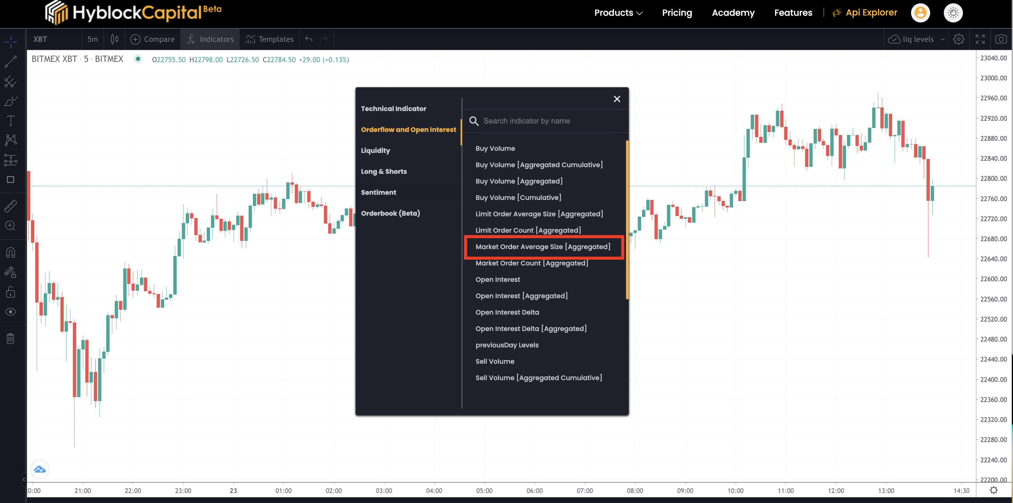
You can access the Buy Volume indicator on the Chart product under the Orderflow & Open Interest indicators. There are four variations of this indicator:

* Buy Volume: Calculated at each candlestick and for a single selected exchange
* Buy Volume \[Aggregated]: Calculated at each candlestick and aggregated across all supported exchanges
* Buy Volume \[Cumulative]: Summation of volume over determined look back period and for a single selected exchange
* Buy Volume \[Aggregated Cumulative]: Summation of volume over determined look back period and aggregated across all supported exchanges

<figure><img src="/files/TMBTkAjlJg04wqMzX2C6" alt=""><figcaption></figcaption></figure>

Buy volume can be used to filter across different trade sizes, which can identify the activity of specific groups of traders, such as institutions or retail traders. For example, if buy volume is increasing and the majority of the buying activity is coming from institutional traders, it may be an indication that positions are being accumulated by large, sophisticated investors, which can be a bullish sign. On the other hand, if buy volume is increasing and the majority of the buying activity is coming from retail traders, it may be an indication that price is being driven by hype or speculation, which can be a bearish sign.\
\
Below you can see how you can filter volume by trades sizes to identify large vs small trade activity.&#x20;

<figure><img src="/files/9dPxXbFd3dH7ElyNXweE" alt=""><figcaption></figcaption></figure>


# Sell Volume

## **Overview**

Volume is at the center of the trading mechanism; without it, the price wouldn't move. There are two types of orders: market (aggressive) orders and limit (passive) orders.&#x20;

A market order is essentially an order placed by someone who wants the trade to execute immediately ("I don't care what the price is; I want to execute right away"), and is thus referred to as an "aggressive" order.&#x20;

A limit order is essentially an order placed by someone who is willing to wait for the price to come to them so they can execute the order ("I don't think it's a good time to sell right now, so I'll place a limit order for $100 above the current price and wait for it to be executed"—thus known as a "passive" order).

Volume is linked to market orders (the orders that have been executed). So, if volume is $5 million in 30 minutes, then we know that this $5 million was through *market* buy orders and *market* sell orders. In other words, buy volume is really *market* buy volume and sell volume is really *market* sell volume.&#x20;

## Where Can I Find This?

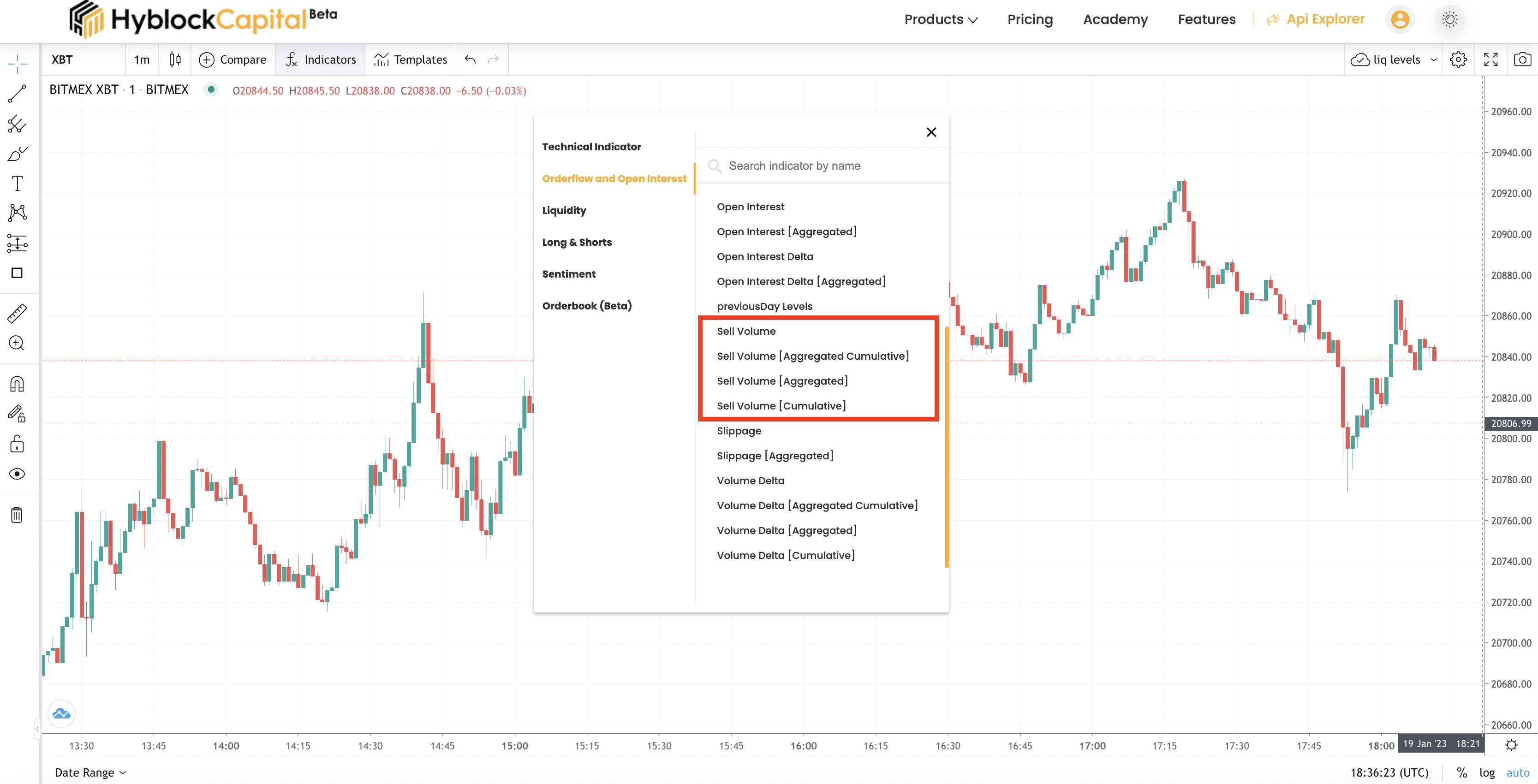
You can access the Sell Volume indicator on the Main Chart product under the Orderflow & Open Interest indicators. There are four variations of this indicator:

* Sell Volume: Calculated at each candlestick and for a single selected exchange
* Sell Volume \[Aggregated]: Calculated at each candlestick and aggregatged across all supported exchanges
* Sell Volume \[Cumulative]: Summation of volume over determined look back period and for a single selected exchange
* Sell Volume \[Aggregated Cumulative]: Summation of volume over determined look back period and aggregated across all supported exchanges.&#x20;

<figure><img src="/files/JNHQr0sSaqheAELX7okG" alt=""><figcaption></figcaption></figure>

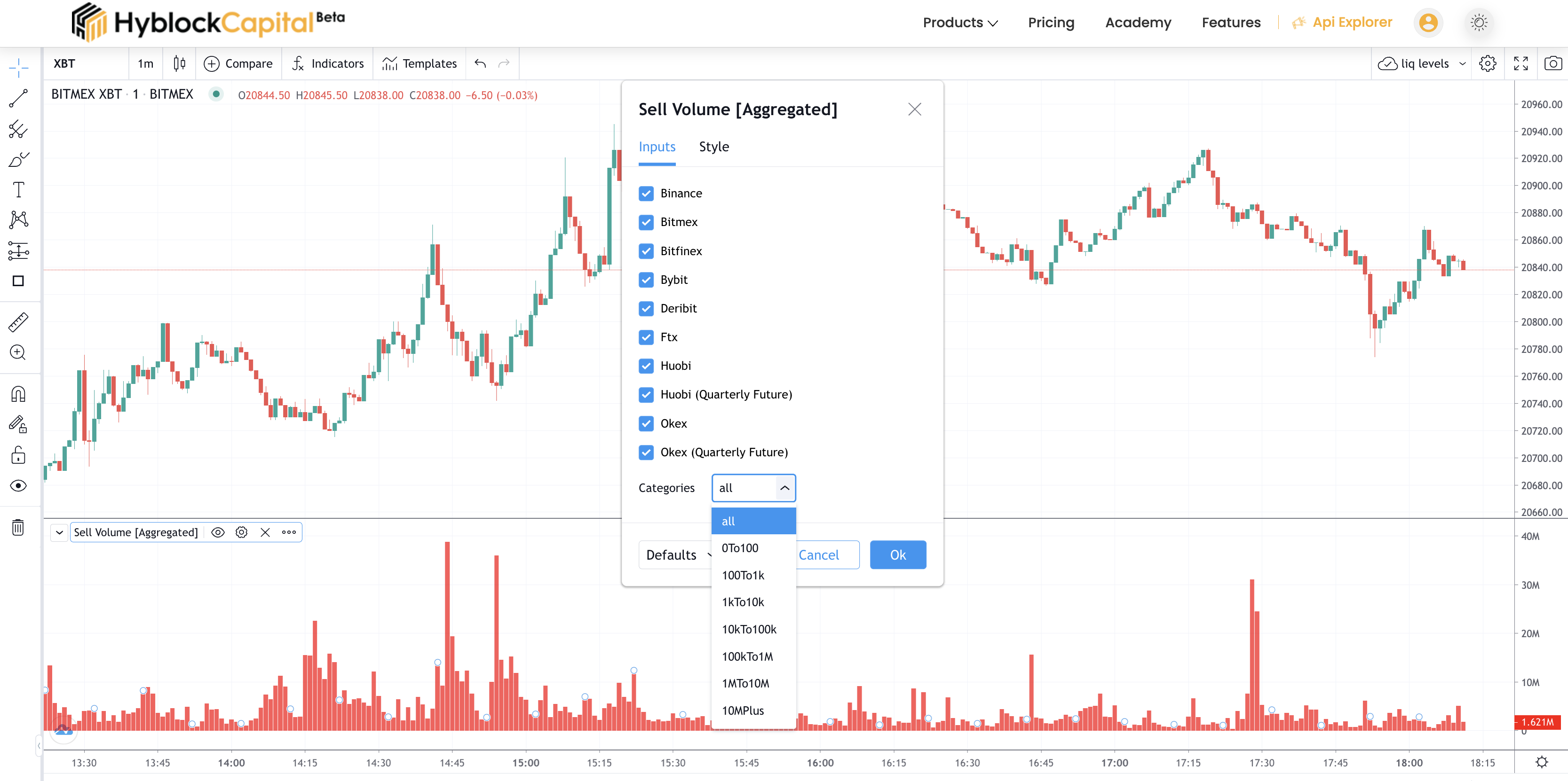
Sell volume can also be used to filter across different trade size which can identify activity of specific groups of traders, such as institutions or retail traders. For example, if sell volume is increasing and the majority of the selling activity is coming from institutional traders, it may be an indication that positions are being accumulated by large, sophisticated investors, which can be a bearish sign. On the other hand, if sell volume is increasing and the majority of the selling activity is coming from retail traders, it may be an indication that price is being driven by hype or speculation, which can be a bullish sign.\
\
You can see how to filter volume by trade size to identify large vs. small trade activity in the image below.&#x20;

<figure><img src="/files/bS0PDEk20Pba1Yj9VdUr" alt=""><figcaption></figcaption></figure>


# Volume Delta (CVD)

## **Overview**

Volume Delta (CVD), or Cumulative Volume Delta, is an advanced order flow indicator widely used in trading. It offers insights into market pressure by calculating the difference between buy volume and sell volume. Essentially, Volume Delta = Buy Volume - Sell Volume. This indicator is available in several variations, each serving different analytical needs:

1. **Volume Delta**: Measures volume delta at each candlestick for a single exchange.
2. **Volume Delta \[Aggregated]**: Similar to the first, but aggregates data across all supported exchanges.
3. **Volume Delta \[Cumulative] (CVD)**: Accumulates the volume delta over a specified lookback period for a single exchange.
4. **Volume Delta \[Aggregated Cumulative]**: Like CVD, but aggregates across all exchanges.

## Where Can I Find This?

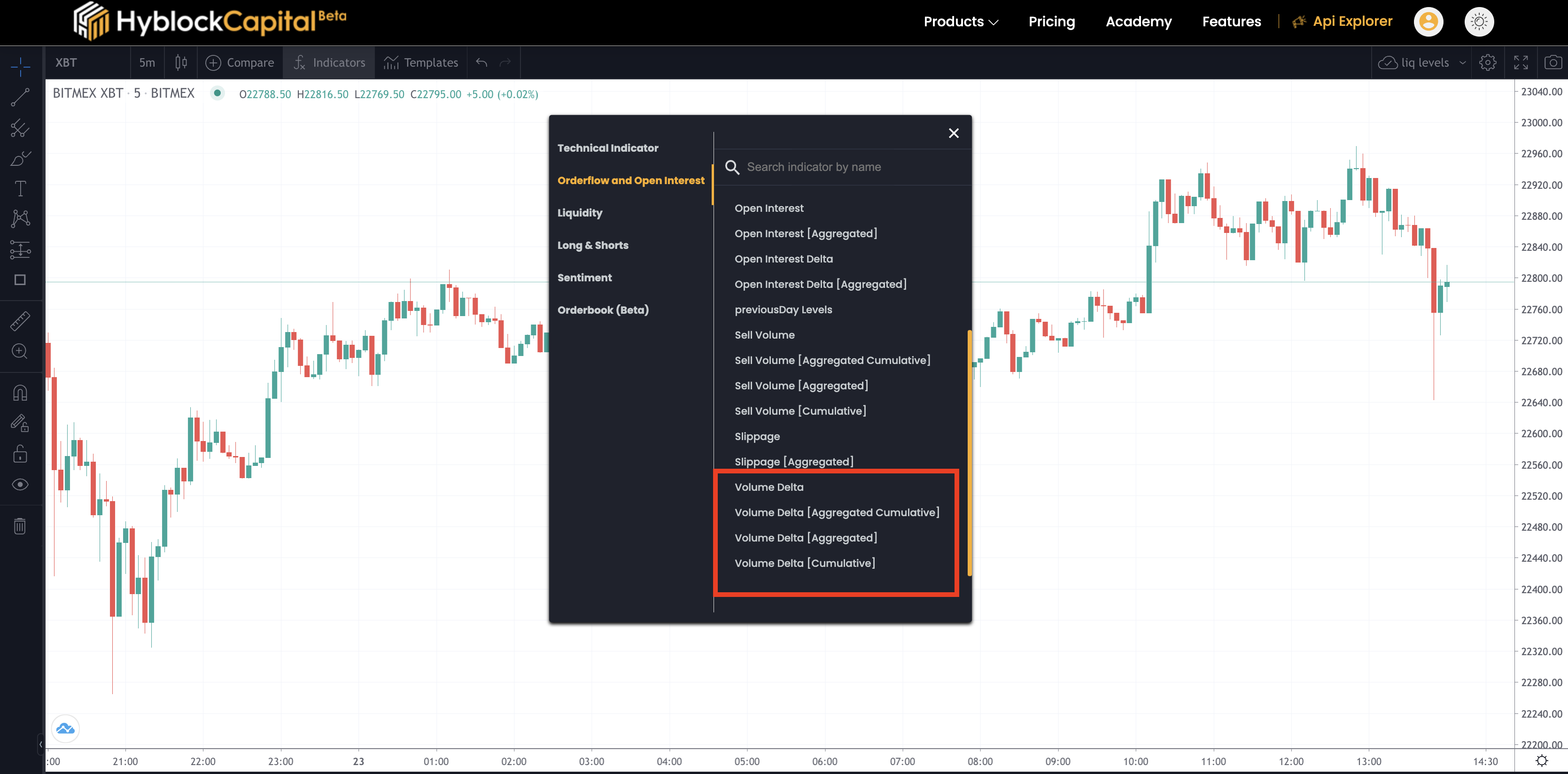
You can access the Volume Delta indicator on the Main Chart product under the Orderflow & Open Interest indicators. There are four variations of this indicator:

* Volume Delta: Calculated at each candlestick and for a single selected exchange
* Volume Delta \[Aggregated]: Calculated at each candlestick and aggregated across all supported exchanges
* Volume Delta \[Cumulative]: The sum of volume delta over a specified lookback and for a single selected exchange (also known as CVD or Cumulative Volume Delta)
* Volume Delta \[Aggregated Cumulative]: The sum of volume delta over a specified lookback, aggregated across all supported exchanges (also known as aggregated CVD)

<figure><img src="/files/FWa6J6WmK66QidBfQQPC" alt=""><figcaption></figcaption></figure>

## Using CVD in Trading

CVD is a potent tool for various analytical purposes:

* **Identifying Buying/Selling Pressure**: A positive CVD suggests dominant buying pressure, while a negative CVD indicates selling pressure.
* **Spotting Potential Turning Points**: Abrupt changes in the CVD trend might signal market reversals.
* **Determining Market Momentum**: Consistently positive and rising CVD lines can indicate a strong bullish trend.

### Lookback Period in CVD

The lookback period in CVD is crucial. It determines the number of bars considered for calculating buying and selling volumes. A longer lookback gives a broader market trend view, while shorter periods respond quicker to market changes.

### Filtering by Trade Sizes

CVD analysis can be refined by filtering based on trade sizes. This can highlight activities of specific trader groups like institutions or retail traders. For instance, a rise in CVD with predominant selling by institutional traders can signal bearish trends, while the opposite might suggest bullish trends driven by retail speculation.

#### Trade Size Buckets

CVD can be displayed for various trade size buckets. Users can choose from ranges like 0 to 100, 1k to 100k, and so on, up to 'Infinity'. This feature allows traders to analyze market behavior in different segments:

* **Small Trades (e.g., 0 to 100)**: Reflects retail trader activity.
* **Medium Trades (e.g., 1k to 10k)**: May represent more committed retail traders or smaller institutional activities.
* **Large Trades (e.g., 100k to 1m)**: Typically indicates institutional trading, providing insights into professional market movements.
* **Very Large Trades (e.g., 10m to Infinity)**: Suggests major institutional involvement, potentially signaling significant market shifts.

### Divergences in Trade Size Buckets

Understanding divergences between different trade size buckets can be crucial for traders. For example:

* **Small Sizes Increasing While Large Sizes Decreasing**: If the CVD for small trade sizes (e.g., 0 to 1k) is increasing while it's decreasing for large trade sizes (e.g., 100k to 1m), it could indicate that retail traders are driving the market up while institutions might be distributing or selling their positions. Such a divergence often suggests a potential market top, where retail enthusiasm is high, but professional players are exiting their positions.

### Identifying Volume Concentration by Bucket Sizes

Each trade size bucket in CVD also helps in determining where the majority of trading volume is originating and what proportion of the total volume each bucket contributes. This analysis is vital for several reasons:

* **Large% of Volume in Small Sizes**: A significant percentage of volume in smaller trade sizes might suggest a retail-driven market, often associated with speculative trading or hype.
* **Dominance in Medium to Large Sizes**: When the bulk of trading volume lies in medium to large sizes, it could indicate a more balanced market with both retail and institutional involvement.
* **Major Volume in Very Large Sizes**: A market where a large proportion of the volume comes from the very large size bucket (e.g., 10m to Infinity) could signify heavy institutional influence, possibly leading to more stable and less volatile market movements.

#### Practical Use Case

Consider a scenario where market prices are rising, but the CVD for small trade sizes is significantly increasing while the CVD for large trade sizes is steadily decreasing. This divergence could be interpreted as a red flag for bullish traders, as it may suggest that while prices are driven higher by retail traders' optimism and smaller trades, institutional traders (reflected in large trade sizes) are possibly taking profits or reducing their positions. Such a situation could lead to a potential reversal if retail momentum wanes and institutional selling pressure dominates.

In summary, analyzing CVD across different trade size buckets not only provides a clearer picture of the current market sentiment but also helps in predicting potential future movements based on the divergence in trading behaviors among different trader groups. This level of analysis is essential for traders looking to understand the depth and nuances of market dynamics.

<br>

<br>


# Market Order Count

**Overview:**\
\
A market order is an order to buy or sell at the market's current best available price. Primary goal of submitting a market order is to ensure immediate execution of a trade. However, it does not guarantee a specified price.\
\
These participants are known as market takers or aggressive orders.\
\
Market and limit orders are constantly being placed at all times during market hours. Studying executed orders can help users understand activity at different price levels whereas resting orders can help identify future potential interest.\
\
In this section we will be focusing on executed orders (orderflow). For more information on resting orders you can look at our [Orderbook](/indicators/orderbook) section.\
\
**Indicator Description:**\
\
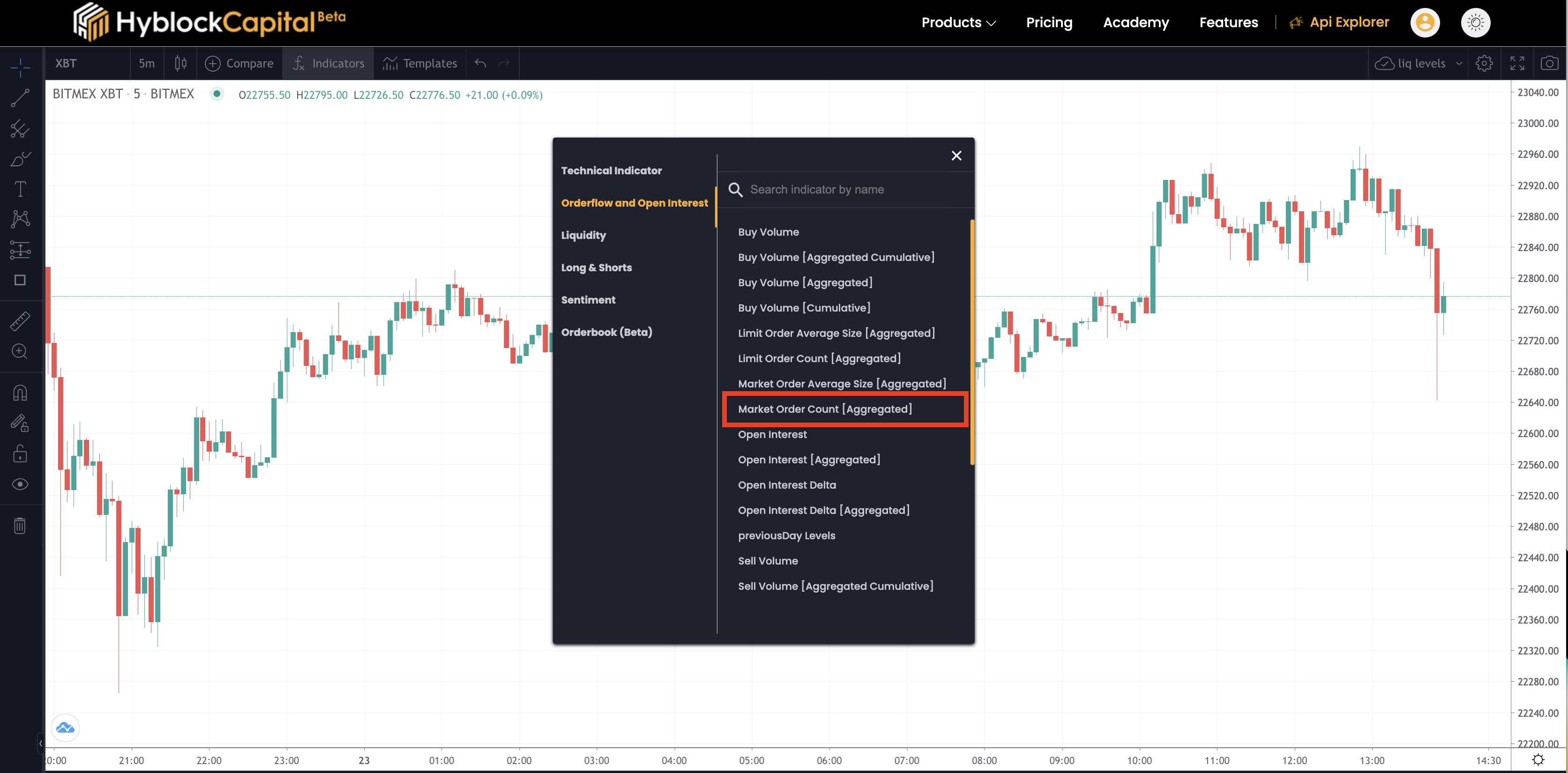
The market order count is a technical analysis tool that shows the number of trades that occurred during a specific time period (candlestick).\
\
You can access the indicator on the Main Chart product under the Orderflow & Open Interest.&#x20;

<figure><img src="/files/AQGNdGQEhF9a1ar3Zk5t" alt=""><figcaption></figcaption></figure>

This indicator can we filtered by the the count of buy trades, sell trades, total trades, and delta during the time period.\
\
Buy: Count of market buy orders

Sell: Count of market sell orders

Total: Count of Buy Orders + Count of Sell Orders

Delta: Count of Buy Orders – Count of Sell Orders\
\
This indicator can be key understanding market sentiment and is an additional way to breakdown buyer and seller activity:&#x20;

* Identifying periods of high trading activity can indicate a potential reversal, a strong support/resistance zone, and other market movements.


# Market Order Average Size

Average size of a market order in a given timeframe

## **Overview**

Market order average size is a metric that measures the average size of market orders placed in a given ticker. Market orders are orders to buy or sell the contract at the current market price. The average size is calculated by dividing the total volume of market orders by the total number of market orders placed.

It's important because it can provide insight into the level of buying or selling activity in the market. A high average size indicates that large market orders are being placed, which may suggest that institutional investors or other large traders are active in the market. A low average size, on the other hand, may suggest that retail investors or other small traders are more active in the market.

It also provides an idea about the liquidity of the coin. A coin with a higher average size would indicate more liquidity in the market and vice versa.

It is calculated by simply dividing the total volume of market orders by the total number of market orders placed. For example, if there were 100 market orders placed for a total of $10,000, the average size of a market order would be 100.

It's important to note that the market order average size is a snapshot of a given period of time and it's only one of many factors to consider when analyzing. Traders should consider other fundamental and technical factors along with the market order average size when making trading decisions.\
\
In this section we will be focusing on executed orders (orderflow). For more information on resting orders you can look at our [Orderbook](/indicators/orderbook) section.

## **Indicator Description**

The market order average size indicator is another orderflow metric that shows the average size of trades that occurred during a specific time period (candlestick).\
\
You can access the indicator on the Chart product under the Orderflow & Open Interest.&#x20;

<figure><img src="/files/8xRwTzAi1yWQlaJud4VE" alt=""><figcaption></figcaption></figure>

This indicator can be filtered by the the count of buy trades, sell trades, total trades, and delta during the time period.

* Buy: Average size of market buy orders
* Sell: Average Size of market sell orders
* Total: Average Size of Buy Orders + Average size of Sell Orders
* Delta: Average size of Buy Orders – Average size of Sell Orders

This indicator can be key understanding market sentiment and is an additional way to breakdown buyer and seller activity:&#x20;

* Identifying periods of high trading activity can indicate a potential reversal, a strong support/resistance zone, and other market movements.
* High market order size can indicate activity is coming from institutions and low size can represent retail.&#x20;
* High market order size can possibly indicate areas of high slippage if combined with high limit order count


# Limit Order Count

Overview\
\
Limit Order is an order to buy or sell a security at a specified price. Primary goal of submitting a limit order is to ensure price however execution of your trade is not guaranteed.\
\
These participants are known as market makers or passive order.\
\
Market and limit orders are constantly being placed at all times during market hours. Studying executed orders can help users understand activity at different price levels whereas resting orders can help identify future potential interest.\
\
In this section we will be focusing on executed orders (orderflow). For more information on resting orders you can look at our [Orderbook](/indicators/orderbook) section.\
\
**Indicator Description:** \
\
The limit order count is a technical analysis tool that shows the number of limit trades that got executed during a specific time period (candlestick).\
\
You can access the indicator on the Main Chart product under the Orderflow & Open Interest.&#x20;

<figure><img src="/files/Qj3F6Zq1LIrgzfQwr3Ba" alt=""><figcaption></figcaption></figure>

This indicator can we filtered by the the count of buy trades, sell trades, total trades, and delta during the time period.\
\
Buy: Count of executed limit buy orders\
Sell: Count of executed limit sell orders\
Total: Count of executed limit Buy Orders + Count of executed limit Orders\
Delta: Count of executed limit Buy Orders – Count of executed limit Sell Orders\
\
This indicator can be key understanding market sentiment and is an additional way to breakdown buyer and seller activity:&#x20;

* Identifying periods of high trading activity can indicate a potential reversal, a strong support/resistance zone, and other market movements.
* High limit order count can possibly indicate areas of high slippage if combined with high market order size


# Limit Order Average Size

**Overview**\
\
Limit Order is an order to buy or sell a security at a specified price. Primary goal of submitting a limit order is to ensure price however execution of your trade is not guaranteed.\
\
These participants are known as market makers or passive order.\
\
Market and limit orders are constantly being placed at all times during market hours. Studying executed orders can help users understand activity at different price levels whereas resting orders can help identify future potential interest.\
\
In this section we will be focusing on executed orders (orderflow). For more information on resting orders you can look at our [Orderbook](/indicators/orderbook) section.\
\
This indicator shows the count of buy trades, sell trades, total trades, and delta during a specific time period, represented by a candlestick on a chart.\
\
You can access the indicator on the Main Chart product under the Orderflow & Open Interest.&#x20;

**Indicator Description**\
\
The limit order average size indicator is another technical analysis tool that shows the average size of resting orders that got executed during a specific time period (candlestick).\
\
You can access the indicator on the Main Chart product under the Orderflow & Open Interest.&#x20;

<figure><img src="/files/xspN51rSNSuicAuF6ecN" alt=""><figcaption></figcaption></figure>

This indicator can we filtered by the the count of buy trades, sell trades, total trades, and delta during the time period.\
\
Buy: Count of executed limit buy orders\
Sell: Count of executed limit sell orders\
Total: Count of executed limit Buy Orders + Count of executed limit Orders\
Delta: Count of executed limit Buy Orders – Count of executed limit Sell Orders\
\
This indicator can be key understanding market sentiment and is an additional way to breakdown buyer and seller activity:&#x20;

* Identifying periods of high trading activity can indicate a potential reversal, a strong support/resistance zone, and other market movements.
* High limit order size can possibly indicate areas of absorptions
* High limit order size can indicate activity is coming from institutions and low size can represent retail.&#x20;


# Transfer of Contracts

## Introduction

The "Transfer of Contracts" indicator is a valuable tool in the world of trading analysis. Derived from volume and open interest data, this indicator provides unique insights into market dynamics. It distinguishes between the volume involved in the exchange or transfer of contracts and the changes in open interest, shedding light on crucial aspects of market behavior.

## What is the "Transfer of Contracts" Indicator?

### **Overview**

The "Transfer of Contracts" indicator, in essence, represents the absolute difference between trading volume and changes in open interest. It focuses on the volume that is involved in the exchange or transfer of contracts, without impacting the net open interest. This concept is particularly significant in understanding trading activities.

### **Concept**

To grasp the indicator's mechanics, consider that it calculates the difference between the total volume of trades and the changes in open interest. It specifically highlights instances where contracts change hands between market participants, providing a clearer picture of trading dynamics.

### **Example**

Let's illustrate this concept with an example. Imagine a scenario where a trader decides to exit a long position of 500,000 contracts through a market sell order. Simultaneously, another trader enters the market with a long position of 500,000 contracts via a limit buy order. In this case, the "Transfer of Contracts" indicator would show a significant volume of 500,000 contracts being transferred without any net change in the overall market position.

## Why is it Important?

### **Market Dynamics Insight**

Understanding the "Transfer of Contracts" indicator is essential because it distinguishes between trades that merely change ownership and those that significantly impact open interest. This insight can be instrumental in deciphering market movements.

### **Identifying Market Behavior**

This indicator helps traders discern whether the trading volume primarily involves new participants entering the market (both longs and shorts) or existing participants exiting. It provides valuable information about market sentiment and potential shifts.

## How Can it be Used?

### **Accumulation/Distribution Analysis**

**Scenario**: The "Transfer of Contracts" indicator can be particularly insightful in identifying accumulation or distribution phases in the  market. A key aspect to monitor is the transfer of contracts between different market participants, such as retail traders and whales (large holders).

**How It Works**: When a significant transfer of contracts occurs without a corresponding change in open interest, it might indicate that whales are distributing their holdings to retail traders, or vice versa. For example, if the indicator shows a large transfer of contracts while the market price remains relatively stable, it could suggest that whales are offloading their positions to retail traders, potentially signaling a distribution phase. On the other hand, a similar pattern with an increasing price might indicate accumulation by whales.

**Interpretation**: This analysis helps in understanding the underlying market sentiment and potential future price movements. If whales are accumulating, it could be a bullish signal, whereas distribution might hint at a bearish trend.

### **Local Reversals Linked to Spikes in Transfer of Contracts**

**Scenario**: Spikes in the "Transfer of Contracts" indicator can be indicative of local reversals in the  market, especially when these spikes are not accompanied by a significant change in open interest.

**How It Works**: A spike in the transfer of contracts, predominantly due to the exchange of existing contracts, can signify a shift in market dynamics. This is especially true when there's a significant trading volume that doesn't lead to new market participants entering or exiting in large numbers.

**Interpretation**: Such a pattern might indicate that the existing market participants are repositioning themselves, possibly in anticipation of a market reversal. If this happens during a price rally, it could suggest that traders are taking profits and preparing for a potential downturn. Conversely, during a downtrend, a spike in the transfer of contracts could signal a bottoming process, where sellers are exhausting, and buyers are starting to dominate, potentially leading to a bullish reversal.

<br>

<br>


# Participation Ratio

## Introduction

In the fast-paced world of cryptocurrency trading, the "Participation Ratio" indicator emerges as a key tool for traders. It offers a unique perspective on market dynamics by analyzing the relationship between volume and open interest. This indicator helps traders gauge the level of new participation in the market, which can be pivotal in understanding market sentiment and potential price movements.

## What is the "Participation Ratio" Indicator?

### **Overview**

The "Participation Ratio" measures the percentage of trading volume represented by the change in Open Interest (OI). It is calculated as the Open Interest Delta divided by the Volume.

### **Concept**

The essence of this indicator lies in differentiating between the volume that results from new market participants entering (or exiting) and the volume from ongoing trading activities.&#x20;

* Very high (positive) participation ratio indicates a significant portion of the trading volume involves new participants
* Very low (negative) participation ratio indicates a significant portion of the trading volume involves  participant exiting
* Flat (close to 0) value suggests existing market players dominate the volume

### **Example**

Consider a situation where the open interest increases by 2 million contracts and the total trading volume is 20 million contracts. The participation ratio here would be 10%, indicating that 10% of the trading volume involves new participants entering the market.

## Why is it Important?

### **Insight into Market Participation**

Understanding the participation ratio is crucial for traders as it provides insights into whether new players are entering (or exiting) the market, or if the trading is predominantly by existing participants.

### **Market Sentiment Indicator**

The participation ratio can serve as a barometer for market sentiment. A rising ratio might indicate growing interest, whereas a falling ratio could suggest waning interest.

## How Can it be Used in Markets?

**Identifying Market Trends**

A consistently high participation ratio during a market rally can signal strong buying interest from new participants, possibly reinforcing the uptrend. Conversely, during market declines, a low participation ratio might indicate that the sell-off is mainly driven by existing participants, hinting at a potential bottom formation.

**Trading Volume Analysis**

By analyzing participation ratio alongside trading volume, traders can distinguish between volume spikes caused by new entrants versus those by existing participants. This distinction is crucial in evaluating the strength of price movements.

## Specific Use Cases

### Transfer of Contracts During High Volume Periods

**Scenario: Transfer of Contracts**

In scenarios where the trading volume is high over a short time frame, yet the Participation Ratio remains flat, a significant transfer of contracts can occur. This happens when one set of market participants is entering positions while an approximately equal number of participants are exiting, leading to a balanced transfer of contracts.

**How It Works**

* **Balanced Entry and Exit:** In this scenario, for every trader or group of traders entering the market (buying contracts), there is an approximately equal number of traders exiting the market (selling contracts). This balance results in high trading volume but little net change in open interest.
* **Example:** Imagine within a 5-minute window, a group of traders purchases 500,000 contracts of a cryptocurrency, while another group simultaneously sells an equal amount. The trading volume spikes due to these transactions, but the open interest remains largely unchanged since the total number of open contracts doesn't increase or decrease significantly.

**Implications**

* **Market Sentiment Analysis:** This kind of transfer can be a key indicator of market sentiment. For instance, if the price remains stable or increases during this period, it might suggest that the selling pressure is being absorbed by new buyers, which could be a bullish sign. Conversely, if the price declines, it may indicate that buyers are not sufficiently absorbing the selling pressure, potentially a bearish signal.
* **Liquidity and Price Stability:** Such balanced transfers often contribute to liquidity and can lead to price stability. They are essential in markets, especially in high-volatility periods, as they allow traders to enter and exit positions without causing significant price disruptions.
* **Strategic Positioning:** Understanding this dynamic can be crucial for traders looking to enter or exit the market. Recognizing a transfer of contracts can help in timing the trades better, especially in anticipating potential resistance or support levels.

### **Bullish and Bearish Engagements**

A surge in the participation ratio amidst a price rally could imply strong bullish engagement, as more new buyers enter the market. In contrast, an increase during a downturn might signal bearish sentiment, with new participants entering short positions.

### **Sentiment Shift Detection**

Sudden changes in the participation ratio can indicate sentiment shifts. For instance, a sharp increase after a prolonged downtrend might signal a reversal as new buyers start to enter, suggesting a potential market turnaround.

<br>


# Previous Day, Week, and Month Technical Levels

## Introduction

In trading, particularly in the volatile cryptocurrency market, understanding historical levels is crucial. Previous day, week, and month levels — including open, high, low, and equilibrium (average of high and low) — are key technical indicators that traders often use as potential support and resistance levels. These levels can provide high reward-to-risk opportunities and help traders make informed decisions.

## What are Previous Day, Week, and Month Levels?

### **Overview**

These levels refer to the open, high, low, and equilibrium (EQ) points from the previous trading day, week, and month. The equilibrium is calculated as the average of the high and low prices.

### **Concept**

The rationale behind using these levels lies in their ability to highlight significant price points that have previously acted as either support or resistance. They are often closely watched by a large number of traders, thereby increasing their relevance.

#### **Calculation**

* **Daily Levels:** Calculated from the previous day's trading data.
* **Weekly Levels:** Derived from the last week's trading range.
* **Monthly Levels:** Based on the previous month's price action.

## Why are They Important?

### **Psychological Significance**

These levels often hold psychological importance for traders and can influence market behavior. For instance, a previous month's high can act as a psychological barrier or target.

### **Decision-Making Tool**

They serve as a guide for placing entry and exit points, setting stop-loss orders, and identifying potential reversal points in the market.

## How Can They be Used?

### **Support and Resistance**

These levels can act as support in a rising market or resistance in a falling market. Traders might look for buying opportunities near the previous day's low or selling opportunities near the previous day's high.

### **Breakout and Reversal Trading**

A breakout above a previous high or a drop below a previous low can signal a strong market move. Conversely, a failure to break these levels might indicate a potential reversal.

## Specific Use Cases

### **Trend Confirmation**

* **Bullish Scenario:** If the price consistently closes above the previous day's or week's high, it might indicate a strong bullish trend.
* **Bearish Scenario:** Conversely, closing below the previous day's or week's low could signal a bearish trend.

### **High Reward-to-Risk Trade Setups**

* Traders might find high reward-to-risk opportunities near these levels. For example, entering a long position near the previous week's low with a tight stop-loss can offer a favorable risk-reward ratio if the level holds as support.

### **Intraday Pivot Points**

* For intraday traders, previous day levels can act as pivot points. Trading strategies might involve buying near the previous day's EQ level or selling near it, depending on the market's overall trend.

### **Swing Trading**

* Swing traders might use previous week or month levels to set longer-term trade targets. For instance, buying near a previous month's low with an aim to sell near the high, or vice versa.


# Anchored CVD

## Definition

Anchored CVD is a specialized variation of the Cumulative Volume Delta (CVD) indicator that resets its calculation at predefined anchor points, such as the start of a day, 4-hour period, or 1-hour period. Like traditional CVD, it tracks the difference between buy volume and sell volume to reveal buying or selling pressure in the market. By anchoring to a specific point (ie. daily open), it highlights intraday shifts in market sentiment more clearly. This helps traders compares buying or selling momentum on a day-to-day basis.

**Key Features:**

* **Reset Points:** The cumulative calculation starts fresh at each anchor point (e.g., daily, 4-hour, or 1-hour intervals).
* **Comparative Analysis:** Enables clearer comparisons of buying and selling behavior across different timeframes.
* **Trend Identification:** Highlights shifts in market sentiment more precisely by isolating periods of activity.

This variation helps traders analyze intraday momentum, spot trend reversals, and compare market pressure across multiple time intervals.


# Anchored Open Interest (OI)

## Definition

Anchored Open Interest (OI) is a specialized variation of the traditional Open Interest indicator that resets its calculation at predefined anchor points, such as the start of a day, 4-hour period, or 1-hour period. Open Interest measures the total number of outstanding derivative contracts (e.g., futures or options) that have not been settled.

**Key Features:**

* **Reset Points:** The cumulative calculation starts fresh at each anchor point (e.g., daily, 4-hour, or 1-hour intervals).
* **Comparative Analysis:** Facilitates clearer comparisons of position buildup and reduction across different timeframes.
* **Market Sentiment Insights:** Highlights periods of significant position changes, providing deeper insight into directional biases and potential reversals.

This variation helps traders analyze intraday changes in market positioning, track how open interest evolves during key periods, and identify patterns of accumulation or distribution.


# Buy Sell Trade Count Ratio

## Definition

Measures the relative proportion of executed buy trade count (both market and limit) versus sell trade count (both market and limit) within a given period. A higher ratio indicates stronger buy-side activity, while a lower ratio points to increased sell-side pressure. \
\
By tracking changes in this ratio over time, traders can gain insights into emerging or fading market momentum on either side of the order flow.


# Slippage

## Definition

Slippage refers to the difference between the expected execution price of a market order and the actual price at which the order is filled. In the context of price slippage, it specifically measures the price impact caused by executing a market order that consumes multiple levels of available liquidity from the order book.

**Example:**\
If you market buy BTC and your order is filled across multiple limit sell orders ranging from $90,000 to $90,002, the slippage is **$2** — representing the difference between the initial price level and the highest execution price within your order.\
\
These individual slippage values are then combined to provide three key metrics:

1. **Maximum Slippage:** The largest price deviation recorded in a single trade.
2. **Total Slippage:** The sum of all price deviations across trades.
3. **Average Slippage:** The average price deviation per trade.

These metrics are broken down into four categories:

* **Buy:** Slippage from buy trades.
* **Sell:** Slippage from sell trades.
* **Total:** Combined slippage from all trades (buy + sell).
* **Delta:** The difference between buy and sell slippage (buy - sell).

**Key Factors Influencing Slippage:**

* **Order Size:** Larger orders are more likely to consume liquidity at multiple price levels.
* **Market Liquidity:** Thin order books with low liquidity often result in higher slippage.
* **Market Volatility:** Rapid price movements can amplify slippage.

Slippage is a critical metric for assessing trade execution quality and understanding the cost associated with market orders, particularly in volatile or low-liquidity environments.


# Volume Ratio

## Definition

The **Volume Ratio** measures the **relative dominance of buy volume versus sell volume** from executed market orders within a specific timeframe. It provides insight into **order flow imbalance** by comparing the net difference between buy and sell volumes against their combined total.

$$
\textbf{Volume Ratio} = \frac{\textbf{Buy Volume} - \textbf{Sell Volume}}{\textbf{Buy Volume} + \textbf{Sell Volume}}
$$

#### **Key Components:**

* **Buy Volume:** The total volume of market **buy orders** executed during the timeframe.
* **Sell Volume:** The total volume of market **sell orders** executed during the timeframe.
* **Ratio Range:** The ratio is typically **bounded between -1 and +1**, where:
  * **+1:** 100% buy volume dominance (only buy orders).
  * **-1:** 100% sell volume dominance (only sell orders).
  * **0:** Equal buy and sell volumes, indicating balance.


# Market Order Count Ratio

## Definition

The **Market Order Count Ratio** measures the **relative dominance of buy market orders versus sell market orders** by comparing the difference in their counts against their combined total. It highlights the **imbalance in the frequency of market buy and sell orders.**

$$
\textbf{Market Order Count Ratio} = \frac{\textbf{Market Order Buy Count} - \textbf{Market Order Sell Count}}{\textbf{Market Order Buy Count} + \textbf{Market Order Sell Count}}
$$

#### **Key Components:**

* **Market Order Buy Count:** The total number of **market buy orders** executed during a specific timeframe.
* **Market Order Sell Count:** The total number of **market sell orders** executed during a specific timeframe.
* **Ratio Range:** The ratio is typically **bounded between -1 and +1**, where:
  * **+1:** 100% buy order dominance (only buy orders).
  * **-1:** 100% sell order dominance (only sell orders).
  * **0:** Equal buy and sell order counts, indicating balance.


# Limit Order Count Ratio

## Definition

The **Limit Order Count Ratio** measures the **relative dominance of executed limit buy orders versus executed limit sell orders** by comparing the difference in their counts against their combined total. It highlights the **imbalance in the frequency of executed limit buy and sell orders**, providing insight into liquidity absorption and market behavior.

$$
\textbf{Limit Order Count Ratio} = \frac{\textbf{Limit Order Buy Count} - \textbf{Limit Order Sell Count}}{\textbf{Limit Order Buy Count} + \textbf{Limit Order Sell Count}}
$$

#### **Key Components:**

* **Limit Order Buy Count:** The total number of **executed limit buy orders** during a specific timeframe (orders resting on the book, filled by market sell orders).
* **Limit Order Sell Count:** The total number of **executed limit sell orders** during a specific timeframe (orders resting on the book, filled by market buy orders).
* **Ratio Range:** The ratio is typically **bounded between -1 and +1**, where:
  * **+1:** 100% buy-side dominance (only limit buy orders were executed).
  * **-1:** 100% sell-side dominance (only limit sell orders were executed).
  * **0:** Equal buy and sell limit order counts, indicating balance.


# Liquidity Indicators


# Top Trader Average Leverage Used

### What is leverage?

Leverage is an important function in the crypto market and some even say it's at the heart of derivatives trading.&#x20;

Most crypto exchanges offer leverage to their users. Leverage allows traders to borrow funds in order to enter a position larger than their own funds permit. Traders who trade with leverage are doing so with the goal of capturing larger gains but also at the risk of being "liquidated", or losing all or nearly all of their Initial Margin. Initial Margin is basically the amount of money coming from the traders pocket. If this trader wants to enter a $5000 trade with 10x leverage, then $500 is the Initial Margin and the remaining $4500 are borrowed funds.

Exchanges cannot allow a trader to lose borrowed funds and therefore close out the position as soon as position losses reach the initial margin. When entering a trade with leverage, most exchanges provide the price at which the trade would be liquidated otherwise known as the liquidation level.

### Why is leverage a useful data point?

If we know the amount of aggregate leverage being taken out by users, then we can also understand how risk-on or risk-off the current market is.&#x20;

For example, if we know that on average, longs are using 12x leverage while shorts are using 2x leverage, this is useful information. It can increase the likelihood of a long squeeze (as price drops, it may trigger a cascade of liquidations, quite common in crypto). Similarly, a market (or trend) may be considered “healthy” if the amount of leverage taken out is low.

### What is this indicator actually showing?

This indicator shows the average leverage taken out by “top traders” (larger accounts), separated by long leverage and short leverage. So if long leverage is 5.6, it implies that longs are taking out 5.6x leverage on average.

![](/files/SlbjqNnDwXFbjw1Y5xUR)

Hyblock users can track not only the current amount of leverage used but also in which direction leverage is trending.

{% hint style="info" %}
Note: Top Traders does not mean the best or sharpest traders, it is just a particular segment of the entire population. Each exchange has their own definition of “top traders”, but in all cases it is just a portion of all accounts either by size of account, volume etc.
{% endhint %}

### Top Trader Average Leverage Delta&#x20;

Users can also look at the "gap" between average long leverage and average short leverage, known as the *delta.* In other words, Top Trader Average Leverage Delta is the difference between leverage used by long and leverage used by shorts.&#x20;

This can be used to track when leverage on one side is significantly offside, identify any spikes in leverage, and monitor which direction leverage is building (trending) toward.


# LiqLevels

Liquidation Levels are estimates of potential price levels where long or short liquidation events may occur. These predictions are based on factors such as leverage, position size, entry price, and margin requirements, offering insights into areas of potential liquidity concentration before they are triggered.

#### **Key Components:**

1. **Leverage Tiers:**\
   Predicted liquidation levels are categorized by the leverage used in positions:
   * **High Leverage:** Positions with high leverage, most sensitive to small price movements.
   * **Medium Leverage:** Positions with moderate leverage, balancing risk and exposure.
   * **Low Leverage:** Positions with lower leverage, requiring significant price moves to trigger liquidation.
2. **Size Tiers:** Predicted liquidation levels are divided into three tiers based on position size: **Tier 1** (small retail positions), **Tier 2** (medium-sized positions), and **Tier 3** (large positions).

&#x20;**LiqLevel Indicators:**

* **LiqLevels - Long \[High Leverage]**
* **LiqLevels - Long \[Medium Leverage]**
* **LiqLevels - Long \[Low Leverage]**
* **LiqLevels - Short \[High Leverage]**
* **LiqLevels - Short \[Medium Leverage]**
* **LiqLevels - Short \[Low Leverage]**


# LiqLevelsCount

**LiqLevelsCount** represents the total number of predicted liquidation levels that are either **opening** or **closing** within a specific timeframe. It provides a numerical overview of liquidation activity, highlighting how many potential liquidation points are being created (opened) or hit/liquidated (closed) as market conditions change.

&#x20;**LiqLevelCount Indicators:**

* **LiqLevelsCount - Longs**
* **LiqLevelsCount - Longs Cumulative**
* **LiqLevelsCount - Shorts**
* **LiqLevelsCount - Shorts Cumulative**
* **LiqLevelsCount - Delta**
* **LiqLevelsCount - Delta Cumulative**
* **LiqLevelsCount - Total**


# LiqLevelsSize

**LiqLevelsSize** represents the total size of predicted liquidation levels that are either **opening** or **closing** within a specific timeframe. It provides a numerical overview of the volume tied to liquidation activity, highlighting the total value of positions associated with potential liquidation points being created (opened) or liquidated (closed) as market conditions change.

&#x20;**LiqLevelSize Indicators:**

* **LiqLevelSize - Longs**
* **LiqLevelSize - Longs Cumulative**
* **LiqLevelSize - Shorts**
* **LiqLevelSize - Shorts Cumulative**
* **LiqLevelSize - Delta**
* **LiqLevelSize - Delta Cumulative**
* **LiqLevelSize - Total**


# Anchored LiqLevelsCount

#### **1. Anchored LiqLevelsCount**

This indicator displays the **cumulative sum** of **predicted long liquidation levels** and **predicted short liquidation levels** within anchored timeframes (e.g., daily, 4-hour, or 1-hour).

* **Visualization:** Represented as **two separate lines** on the same chart:
  * **Long Liq Levels Line:** Tracks the cumulative count of predicted long liquidation levels.
  * **Short Liq Levels Line:** Tracks the cumulative count of predicted short liquidation levels.

**Purpose:**

* Compare the buildup of long vs. short liquidation levels over time.
* Identify imbalances between long and short liquidation activity.
* Highlight directional market stress points.

#### **2. Anchored LiqLevelsCount - Delta Cumulative**

This indicator calculates the **difference** between the cumulative predicted **long liquidation levels** and **short liquidation levels** during the same anchored interval:

Delta= (Long Liq Levels Count) − (Short Liq Levels Count)

* **Visualization:** Represented as a **bar graph**, where:
  * **Positive Delta:** Long liquidation levels exceed short liquidation levels.
  * **Negative Delta:** Short liquidation levels exceed long liquidation levels.

**Purpose:**

* Highlight the net directional bias of liquidation levels.
* Identify periods where one side (long or short) dominates liquidation activity.
* Provide signals for potential reversals or continuation trends based on liquidation imbalances.

***

#### **Why They Matter:**

* **Market Sentiment Analysis:** Understand whether long or short liquidation levels dominate during specific intervals.
* **Liquidity Insights:** Identify key periods where large-scale liquidation events may trigger significant market moves.
* **Comparative Analysis:** Analyze liquidation trends across multiple anchored periods for clearer insights into market behavior.

Together, **Anchored LiqLevelsCount** and **Anchored LiqLevelsCount Delta Cumulative** provide a comprehensive view of liquidation activity, helping traders make informed decisions based on directional imbalances and cumulative liquidation trends.


# Anchored LiqLevelsSize

#### **1. Anchored LiqLevelsSize**

This indicator displays the **cumulative sum** of the **predicted long liquidation size** and **predicted short liquidation size** within anchored timeframes (e.g., daily, 4-hour, or 1-hour).

* **Visualization:** Represented as **two separate lines** on the same chart:
  * **Long Liq Levels Size Line:** Tracks the cumulative size of predicted long liquidation levels.
  * **Short Liq Levels Size Line:** Tracks the cumulative size of predicted short liquidation levels.

**Purpose:**

* Compare the scale of long vs. short liquidation levels over time.
* Identify imbalances in liquidation size between long and short positions.
* Highlight areas where significant capital is at risk of liquidation.

***

#### **2. Anchored LiqLevelsSize - Delta Cumulative**

This indicator calculates the **difference** between the cumulative predicted **long liquidation size** and **short liquidation size** during the same anchored interval:

Delta= (Long Liq Levels Size) − (Short Liq Levels Size)

* **Visualization:** Represented as a **bar graph**, where:
  * **Positive Delta:** Long liquidation size exceeds short liquidation size.
  * **Negative Delta:** Short liquidation size exceeds long liquidation size.

**Purpose:**

* Highlight the net bias of liquidation levels.
* Identify periods where one side (long or short) carries a larger liquidation risk.
* Provide signals for potential market stress points or volatility based on size imbalances.

***

#### **Why They Matter:**

* **Market Risk Analysis:** Understand whether long or short positions carry a larger risk of liquidation.
* **Liquidity Insights:** Identify high-risk zones where significant liquidation events could impact market stability.
* **Comparative Analysis:** Analyze trends across multiple anchored periods to better understand market positioning.

Together, **Anchored LiqLevelsSize** and **Anchored LiqLevelsSize Delta Cumulative** provide a comprehensive view of the **magnitude** behind predicted liquidation levels, helping traders assess capital exposure and prepare for potential market moves driven by liquidation events.


# Liquidations

The **Liquidation** measures the **actual amount of long and short liquidations** that occurred within a specific timeframe (e.g., candle period). It captures the total value of positions forcefully closed due to insufficient margin, providing insights into real-time liquidation activity rather than predicted price levels.

#### **Key Components:**

* **Long Liquidations:** The total value of long positions forcefully closed during the timeframe.
* **Short Liquidations:** The total value of short positions forcefully closed during the timeframe.
* **Delta Liquidations:** The difference between long positions and short positions forcefully closed during the timeframe.
* **Total Liquidations:** The combined value of long and short liquidations within the period.

**Trade Size Buckets**

Liquidations can be displayed for various size buckets. Users can choose from ranges like 0 to 100, 1k to 100k, and so on, up to 'Infinity'. This feature allows traders to analyze market behavior in different segments:

* **0 to 100 (Smallest)**
* **100 to 1k (Smaller)**
* **1k to 10k (Small)**
* **10k to 100k (Medium)**
* **100k to 1m (Large)**
* **1m to 10m (Larger)**
* **10m to Infinity (Largest)**


# Longs & Shorts Indicators


# Binance Longs & Shorts

Indicators based on tracking longs and shorts on Binance exchange.

Binance provides 3 separate indicators that help identify long (and short) direction.&#x20;

1\) **Global Longs & Shorts  Accounts:** This measures the total number of \*accounts\* that are long (or short) on Binance. So for example, if there are 1million accounts on Binance and 600k of them are net long, then the global accounts long% is 60% (and short% = 40%). Each account gets one "vote" &#x20;

2\) **Top Trader Longs & Shorts Accounts**: This measures the total number of \*top trader accounts\* that are long (or short) on Binance. Note, top traders do not necessarily mean the best traders or those with the highest profits, but rather Binance classifies top traders as accounts with the top20% in margin (or balance). This indicator is similar to Global Long Accounts with the only difference being that it focuses on the top 20% accounts.

3\) **Top Trader Longs & Shorts Positions:** This measures the total number of \*top trader positions\* that are long (or short) on Binance. The key difference here is that instead of looking at accounts, it instead looks at positions. For example, let's say there are 10 accounts that make up top traders and these positions are the following:

| Trader | Side  | Size     |
| ------ | ----- | -------- |
| 1      | Long  | 100k     |
| 2      | Long  | 200k     |
| 3      | Long  | 100k     |
| 4      | Short | 500k     |
| 5      | Long  | 100k     |
| 6      | Short | 1million |
| 7      | Long  | 200k     |
| 8      | Short | 500k     |
| 9      | Long  | 200k     |
| 10     | Long  | 100k     |

So in total, we have 7 accounts that are long and 3 accounts that are short. This mean 70% of \*accounts\* are long. However, in terms of positions (or size), 1m positions are long and 2m positions are short, implying that 33% \*positions\* are long.&#x20;

We use top trader positions as a proxy to whale positions and global accounts as a proxy to retail. Traders and researchers can use these indicators to understand where the majority of positions lie and how larger positions diverge or converge with the majority of accounts (retail). Combining these indicators with open interest can often explain a lot on how the market participants are positioning themselves.&#x20;


# Bitmex Net Longs & Shorts

Some exchanges provide long and short data in some capacity (like Binance). Bitmex, unfortunately, does not. So we went ahead and tried to approximate this data using a combination of Open Interest, Buy/Sell Volume and a couple other metrics.

The general idea derives from the following combinations:

| Price Change    | Open Interest (OI) Change | Result          |
| --------------- | ------------------------- | --------------- |
| Price goes up   | OI goes up                | longs entering  |
| Price goes down | OI goes up                | shorts entering |
| Price goes up   | OI goes down              | shorts closing  |
| Price goes down | OI goes down              | longs closing   |

However, there are two flaws to the above approach.&#x20;

1. The assumption is that price going up means that there is more buying than selling, hence more net buying with an increase in OI = longs entering. Similarly, price going down would mean more selling than buying. However, this is not always the case, as price can go up with more selling than buying (due to an imbalance in orderbook). Hence, one must look at buy volume and sell volume in combination with OI, rather than price.&#x20;
2. When we say “longs entering”, this can be confusing. If OI goes up by 1million, this means 1 million longs entered and 1 million shorts entered. The number of longs and shorts in total are always the same. What “longs entering” really means is longs entering via market (aggressive) orders.

Buy Volume and Sell Volume is based on market orders.Since buy volume and sell volume is used as a key ingredient in net longs & net shorts data, we are actually estimating what the aggressive orders are doing. Some assume that this market data is more representative of retail data as retail is more likely to pay a larger fee for their orders.

#### Why do we use OI as another metric in estimating net longs and shorts?

A key concept to understand is that buy volume increasing does not automatically mean longs entering (or short volume increasing does not mean shorts entering). If we know that a market buy led to an increase in open interest, then yes, that market buy is likely associated with longs opening. However, if that market buy is coupled with open interest decreasing, then likely that market buy is longs closing.&#x20;

Below is a table explaining all the combinations and *why* open interest is important to this estimation.

| Market Order Type | Open Interest Change | Result          |
| ----------------- | -------------------- | --------------- |
| Market Buy        | OI Increase          | Longs entering  |
| Market Sell       | OI Increase          | Shorts entering |
| Market Buy        | OI Decrease          | Shorts exiting  |
| Market Sell       | OI Decrease          | Longs exiting   |


# Whale vs Retail Delta

Our whale vs retail delta indicator (WRD) *for binance* is used throughout many of the hyblock products including the main charts, probability histogram, coin screener, etc.&#x20;

The concept of this indicator is to try to identify large gaps between retail long% and whale long%. So for example, if retail is constantly long and increasing their long% over time, while whales are heavier on the short side (and/or reducing their long exposure), the whale vs retail delta will display this.

This indicator ranges from -100 to 100, with 0 representing whales and retail positioned exactly the same. Very high (or positive) values of WRD indicate that whales having higher long exposure than retail while low (or negative) values indicate retail has more long exposure than whales.

It is also important to identify the directionality of WRD and which way the indicator is trending. For example, if WRD has a value of -30 and then starts increasing to -10, this can indicate that whales are increasing their long exposure (or reducing short exposure), while retail are doing the opposite (despite the value being negative).&#x20;

More often than not when whales are taking the opposite side of retail, it is the whale that are usually right (note: like everything in trading, nothing is 100%). Finding these divergences early can help spot a breakout trade or even periods of accumulation / distribution.&#x20;


# True Retail Longs & Shorts

## Definition

The **True Retail Longs & Shorts** indicator tracks the percentage of **retail accounts** on Binance that are holding long versus short positions. Unlike volume-weighted metrics, this indicator assigns **equal weight to each retail account**, ensuring that every account contributes **one vote**, regardless of position size.

#### **Key Components:**

* **True Retail Longs (%):** The percentage of retail accounts currently holding long positions.
* **True Retail Shorts (%):** The percentage of retail accounts currently holding short positions.
* **Equal Weighting:** Each account contributes equally, preventing large positions from skewing the data.

#### **Why It Matters:**

* **Retail Sentiment:** Offers a clear view of market sentiment among retail traders.
* **Directional Bias:** Highlights whether retail traders are leaning more bullish (long) or bearish (short).
* **Market Psychology:** Provides insight into crowd behavior, which is often a key driver of short-term market moves.

This indicator helps traders and analysts better understand **retail positioning trends**, offering valuable signals about potential market sentiment shifts or herd mentality behavior in trading activity.


# Anchored Binance Longs & Shorts Ratios

## Definition

These **anchored indicators** are a specialized variation of the traditional binance long short indicators that resets its calculation at predefined anchor points, such as the start of a day, 4-hour period, or 1-hour period.&#x20;

**Key Features:**

* **Reset Points:** The cumulative calculation starts fresh at each anchor point (e.g., daily, 4-hour, or 1-hour intervals).
* **Comparative Analysis:** Facilitates clearer comparisons of position buildup and reduction across different timeframes.
* **Market Sentiment Insights:** Highlights periods of significant position changes, providing deeper insight into directional biases and potential reversals.

These **indicators** provide insights into trader behavior and positioning across different account types on Binance:\
\
**Anchored Long Short Indicators:**

**1. Anchored Global Longs and Shorts Accounts (Binance)**\
**2. Anchored Top Trader Longs and Shorts Accounts (Binance)**\
**3. Anchored Top Trader Longs and Shorts Positions (Binance)**\
**4. Anchored Whale vs Retail (Binance)**

***

####


# Cumulative Net Longs & Shorts (CLS & CLSD)

## Definition

#### **Cumulative Net Longs & Shorts**

The **Cumulative Net Longs & Shorts (CLS)** indicator tracks the **net difference between long and short positions** over time, providing insight into the overall directional bias of market participants. It aggregates the total net positioning from longs and shorts across a given timeframe (e.g., daily, 4-hour, or 1-hour), offering a dynamic view of market sentiment and positioning trends.

***

#### **Key Components:**

1. **Cumulative Net Longs:** The aggregated total of long positions after subtracting closed long positions over time.
2. **Cumulative Net Shorts:** The aggregated total of short positions after subtracting closed short positions over time.
3. **Cumulative Net Longs & Shorts Delta (CLSD):** The difference between **Cumulative Net Longs** and **Cumulative Net Shorts**, calculated as:

Delta = (Cumulative Net Longs) − (Cumulative Net Shorts)

* **Positive Delta:** Indicates that long positions dominate net positioning.
* **Negative Delta:** Indicates that short positions dominate net positioning.

***

#### **Visualization:**

* **Cumulative Net Longs & Shorts:** Typically displayed as two separate lines on a chart:
  * **Net Longs Line:** Represents the cumulative total of long positions.
  * **Net Shorts Line:** Represents the cumulative total of short positions.
* **Cumulative Net Longs & Shorts Delta:** Displayed as a **bar graph** to visualize the net difference between longs and shorts.

***

#### **Why It Matters:**

* **Directional Bias:** Highlights imbalances between long and short positioning trends.
* **Trend Confirmation:** Persistent dominance of longs or shorts can indicate strong directional conviction.
* **Reversal Signals:** Sudden shifts in delta values may signal potential trend reversals.

The **Cumulative Net Longs & Shorts** indicator, along with the **Cumulative Net Longs & Shorts Delta**, provides a comprehensive view of market positioning dynamics, helping traders identify sentiment trends, potential reversals, and key liquidity zones.


# Anchored CLS & CLSD

## Definition

These two indicators provide insights into **net long and short positioning** over **anchored time intervals** (e.g., daily, 4-hour, or 1-hour), offering a standardized view of market sentiment and directional bias.

***

#### **1. Anchored Cumulative Net Long Short (Anchored CLS)**

**Anchored CLS** calculates the **cumulative net difference between long and short positions** within a predefined anchored timeframe, resetting at regular intervals (e.g., daily, 4-hour, or 1-hour).

**Key Features:**

* **Reset Points:** Calculation starts fresh at each anchor point (e.g., daily, 4-hour, or 1-hour).
* **Longs:** Tracks the total net long positions within the anchored period.
* **Shorts:** Tracks the total net short positions within the anchored period.

**Visualization:** Represented as two separate lines:

* **Anchored Net Longs Line:** Tracks the cumulative total of net long positions.
* **Anchored Net Shorts Line:** Tracks the cumulative total of net short positions.

**Why It Matters:**

* Provides clarity on net positioning trends within anchored timeframes.
* Highlights periods of sustained long or short dominance.
* Identifies positioning shifts across standardized time intervals.

***

#### **2. Anchored Cumulative Net Long Short Delta (Anchored CLSD)**

**Anchored CLSD** calculates the **difference between Anchored Net Longs and Anchored Net Shorts** within the same predefined anchor points.

Delta = (Anchored Net Longs) − (Anchored Net Shorts)

**Key Features:**

* **Positive Delta:** Long positions dominate during the anchored timeframe.
* **Negative Delta:** Short positions dominate during the anchored timeframe.

**Visualization:** Represented as a **bar graph**, where:

* **Positive Bars:** Indicate net long dominance.
* **Negative Bars:** Indicate net short dominance.

**Why It Matters:**

* Highlights directional bias within anchored periods.
* Identifies imbalances in positioning that may signal market trends or reversals.
* Provides clear comparisons of long vs. short sentiment across multiple anchored intervals.

***

#### **Why These Indicators Matter Together:**

* **Market Sentiment Analysis:** Clearly distinguish between long and short positioning trends.
* **Directional Insights:** Understand whether long or short traders dominate during specific anchored intervals.
* **Comparative Analysis:** Consistent anchor points allow for trend analysis across different timeframes.
* **Risk Management:** Identify potential market stress points caused by extreme long or short dominance.

Together, **Anchored CLS** and **Anchored CLSD** offer traders a structured, time-anchored view of market positioning, helping to identify trends, imbalances, and potential turning points in trader sentiment.


# Trader Sentiment Gap

The **Trader Sentiment Gap** measures the **difference in sentiment between top traders and retail traders**, offering insight into how these two groups are positioned relative to each other. It highlights the divergence or alignment in market outlook between **large-scale traders** and **smaller, retail-focused participants**.

Extreme values can signal differing expectations or strategies between these two groups.


# Whale Position Dominance

## Definition

**Whale Position Dominance** measures the **relative influence of the largest traders within the top trader group** by analyzing their l**ong% positioning**. It highlights whether market positioning is driven more by the **largest whales** or distributed across **medium-sized traders**.

#### **Key Insights:**

* **Higher Values:** Indicate that the largest whales are exerting greater dominance in **Long% positioning**.
* **Lower Values:** Suggest that medium-sized traders, or in some cases even smaller participants, are playing a more significant role in **Long% positioning**.

#### **Why It Matters:**

* **Market Behavior Analysis:** Understand whether **Long% positioning** is concentrated among a few dominant players or distributed across a broader group of traders.
* **Liquidity Insights:** Large whale dominance can signal concentrated capital flows and stronger directional conviction.
* **Trend Strength:** Higher dominance values may reinforce directional trends, while lower values suggest distributed sentiment and potentially weaker directional bias.

This indicator provides valuable insights into **capital concentration and Long% positioning within top traders**, offering a clearer view of market dynamics and the role of large-scale participants in driving price movements.


# Sentiment


# Twitter - Cashtag Count

The world of cryptocurrency is fast-paced and ever-changing. With new developments and trends emerging daily, traders and investors need real-time information to stay ahead of the curve. Social media platforms, especially Twitter, have become critical sources of information and sentiment analysis in the crypto community.

At Hyblock, we recognize the importance of incorporating social media data into our platform, and we're excited to announce the integration of Twitter data! As part of this integration, we're launching our first-ever Twitter-based metric: the **Twitter - Cashtag count** for $BTC.

## What is the Twitter - Cashtag count?

The "Twitter - Cashtag count" is an innovative metric that collects and displays the number of tweets mentioning the cashtag "$BTC." To ensure accuracy and minimize noise, we exclude tweets with fewer than 20 characters, effectively filtering out spam and irrelevant content. This metric provides valuable insights into the sentiment and activity surrounding Bitcoin on Twitter.

<figure><img src="/files/0XWj3vvEaiPV0bTprb12" alt=""><figcaption></figcaption></figure>

## Why is it important?

Understanding the social media sentiment around cryptocurrencies is crucial for traders and investors. The "Twitter - Cashtag count" allows users to make more informed decisions by providing a real-time snapshot of the Twitter buzz surrounding Bitcoin. By staying on top of the latest conversations and trends, users can gain a competitive edge in the fast-paced world of cryptocurrency trading.

## How to access the Twitter - Cashtag count

To start using the "Twitter - Cashtag count" on the Hyblock platform, follow these simple steps:

1. Go to "Charts."
2. Select "Indicators."
3. Navigate to the "Sentiment" section.
4. Locate and select the "Twitter - Cashtag count" from the list of available indicators.

With the "Twitter - Cashtag count" at your disposal, you'll be able to make more data-driven decisions, leveraging the power of Twitter data to enhance your crypto trading experience.

<figure><img src="/files/wU3Umldfro1N7ZPPluCr" alt=""><figcaption></figcaption></figure>

## Use Cases for the Twitter - Cashtag count

The "Twitter - Cashtag count" offers valuable insights and can be applied to various trading scenarios. Below, we highlight multiple cases that demonstrate the potential of this metric in enhancing your trading strategies.

### &#x20;Use Case 1: Spikes at the start of the hour

A pattern observed with the "Twitter - Cashtag count" is a spike in the number of $BTC-related tweets at the beginning of each hour. This pattern is likely due to automated bots and Twitter alerts that are activated at the start of the hour, resulting in a surge of tweets.

<figure><img src="/files/FvoenfSn27JayH13tQvy" alt=""><figcaption><p>$BTC tweets spike at the start of every hour</p></figcaption></figure>

However, if a significant spike occurs at any other minute within the hour, it could hold more significance. For example, a recent local bottom was created when tweets spiked unexpectedly outside of the hourly pattern. By closely monitoring the "Twitter - Cashtag count," traders can identify these anomalies and use them as potential trading signals, indicating a shift in market sentiment or an upcoming price movement.

<figure><img src="/files/BHTPEkXrK1T6gVJ83PdR" alt=""><figcaption><p>Local Bottom marked by spike in $BTC tweets (1min timeframe)</p></figcaption></figure>

### Use Case 2: Discrepancy between tweets and volume

Another interesting use case for the "Twitter - Cashtag count" is when a discrepancy exists between tweet volume and trading volume:

1. **Tweets spike, but trading volume doesn't**: If there's a sudden increase in the number of $BTC-related tweets but trading volume remains relatively unchanged, it could suggest that the market sentiment hasn't translated into actual trading activity. This scenario might indicate a potential upcoming price movement or a false signal that needs further investigation.

<figure><img src="/files/BZe0AJaTcId6k2xHzqgs" alt=""><figcaption></figcaption></figure>

2. **Trading volume spikes, but tweets don't**: If trading volume increases significantly while the number of $BTC-related tweets remains relatively stable, it could indicate that market participants are acting based on information that hasn't yet reached the broader public. In such cases, traders can use the "Twitter - Cashtag count" to gauge whether the price movement is sustainable or if it's a short-lived anomaly.

<figure><img src="/files/qMykLqDGSYn8tt1zqtzT" alt=""><figcaption></figcaption></figure>

By analyzing the relationship between the "Twitter - Cashtag count" and trading volume, traders can gain a more comprehensive understanding of market dynamics, enabling them to make better-informed decisions.

By incorporating the "Twitter - Cashtag count" into your trading strategy, you can leverage real-time Twitter data to identify patterns, discrepancies, and potential trading signals. As you continue to explore this metric's use cases, you'll be better equipped to navigate the complex and ever-changing world of cryptocurrency trading.

### Use Case 3: Relationship between tweets and open interest (OI)

The "Twitter - Cashtag count" can also be used to analyze the relationship between tweet volume and open interest (OI) in the crypto market. Open interest represents the total number of outstanding contracts held by market participants, indicating the level of interest and activity in the market.

1. **Tweets spike, and OI increases afterwards**: If there is a sudden increase in the number of $BTC-related tweets followed by a rise in open interest, it could suggest that market sentiment is translating into actual trading positions. This scenario might indicate a potential trend continuation or the beginning of a new trend.
2. **Tweets do not spike, and OI increases**: If open interest increases while the number of $BTC-related tweets remains stable, it could indicate that market participants are quietly accumulating positions without causing much buzz on social media. In such cases, traders can use the "Twitter - Cashtag count" to gauge the sustainability of the trend and identify potential trading opportunities.
3. **Tweets spike, and OI decreases afterwards**: If a sudden increase in the number of $BTC-related tweets is followed by a decrease in open interest, it could suggest that market sentiment is shifting, and traders are closing their positions. This scenario might indicate a potential trend reversal or profit-taking.
4. **Tweets do not spike, and OI decreases**: If open interest decreases while the number of $BTC-related tweets remains stable, it could indicate that market participants are closing their positions without causing much discussion on social media. In such cases, traders can use the "Twitter - Cashtag count" to assess the market dynamics and identify potential trading signals.

By examining the relationship between the "Twitter - Cashtag count" and open interest, traders can gain a deeper understanding of the interplay between market sentiment and trading activity. This analysis can help traders make more informed decisions and better navigate the complexities of the cryptocurrency market.

## The future of Twitter-driven metrics at Hyblock

The integration of Twitter data is just the beginning. We're committed to continuously improving and expanding our offerings, and we're excited to introduce more sentiment-related metrics and tools in the future. As the world of cryptocurrency evolves, so will our platform, providing you with cutting-edge insights and tools to support your trading journey.

We appreciate your support and would love to hear your thoughts and suggestions. Please don't hesitate to share your feedback with us as we continue to innovate and grow.

Stay tuned for more exciting developments and happy trading!<br>


# Margin Lending Ratio \[Okx]

Margin Trading allows investors to borrow cryptocurrencies and leverage their trading position to potentially increase returns. For example, traders may borrow tether (usdt) to increase exposure to BTC.&#x20;

### Definition

OKx provides ratio known as Margin Lending Ratio and define it as "This indicator shows the ratio of cumulative data value between BTC/USDT leverage quote currency (USDT) and underlying asset (BTC) over a given period of time."

This may sound confusing so let's simplify. The BTC margin lending ratio shows how much USDT is borrowed versus how much BTC is borrowed (quoted in USDT) when trading BTC/USDT margin.&#x20;

If 1000 USDT is borrowed and 500 USDT (in BTC) is borrowed, then the ratio is 1000/500 = 2.

### Concept

If the ratio is increasing (let's say from 15 to 25), then this means more USDT is being borrowed in comparison to BTC. Generally, USDT is usually borrowed to increase exposure to BTC and reflects a bullish sentiment.&#x20;

On the other hand, if the ratio is decreasing, then this means more BTC is being borrowed in comparison to USDT. Generally, BTC is borrowed too short and reflects a bearish sentiment.&#x20;

The lending ratio provides more edge when compared with how price has behaved over that same time period of borrowing:

* USDT is being heavily borrowed (to potentially buy BTC) + price action is flat / decreasing -> leverage traders are in a loss and underwater. This will likely force deleveraging and can create bearish continuation in BTC/USDT price.&#x20;
* BTC is being heavily borrowed (presumingly to short BTC) + price action is flat / increasing -> traders are in a loss and underwater. This will likely force deleveraging and can create bullish continuation (ie. to close a short they have to buy back BTC, creating buy pressure).
* Large increases in leverage can also be indication of future volatility.

Similar to retail long/short ratios, what we often see is that when the market has a bullish sentiment, price action becomes bearish and vice versa. So an increasing margin lending ratio may imply that the market is more bullish (since they are borrowing more USDT than BTC, to presumingly buy more BTC), which could lead to bearish price action due to the above reasons.&#x20;

### Where can I find this?

The Margin Lending Ratio \[Okx] is found in our main charting application (Tools -> Charts). Within our main charting application, it is found in the Indicators Sentiment Section (as per the image). It is currently available for BTC and ETH across 6 timeframes (1min, 5min, 15min, 1hr, 4hr, 1day).

<https://hyblockcapital.com/chart>

![Margin Lending Ratio along side BTC price](/files/qJz75xmo9PLqvtWSg3rT)

&#x20;


# Bot Tracker

## Introduction

In the realm of cryptocurrency trading, the "Bot Tracker" indicator emerges as a sophisticated tool for monitoring and interpreting market activities that are likely driven by bots. This indicator tracks and counts specific types of market orders, often executed in a pattern that suggests automated trading. Understanding bot activity can provide traders with unique insights into market dynamics and potential influences on price movements.

## What is the "Bot Tracker" Indicator?

### **Overview**

The Bot Tracker is designed to identify and count market orders that resemble bot activity. These are typically repetitive orders with distinctive characteristics, such as orders of the same size occurring multiple times within a short period.

**Functionality**

The indicator focuses on patterns in market orders (both buys and sells) that are indicative of automated trading strategies. For example, detecting multiple orders of 556,661 units executed in the same minute would be flagged as potential bot activity.

**Filters**

Traders can filter the results to focus on specific aspects:

* **Buys:** Tracks only buy orders that suggest bot activity.
* **Sells:** Focuses on sell orders indicative of bots.
* **Total:** Counts all bot-like activities, irrespective of buy or sell.
* **Delta (Buys - Sells):** Provides a net view of bot activity, showing whether bots are predominantly buying or selling.

## Why is it Important?

### **Market Influence**

Bot-driven trades can significantly influence market dynamics, sometimes leading to sudden price movements or increased volatility.

### **Trading Strategy Adjustment**

Understanding bot activity can aid traders in adjusting their strategies, particularly in short-term or high-frequency trading scenarios.

## How Can it be Used in Crypto Markets?

### **Detecting Market Sentiment**

An increase in bot-driven buys or sells can indicate prevailing market sentiment. For example, a surge in bot buys might suggest bullish sentiment.

**Identifying Potential Price Movements**

High bot activity, especially in the delta metric, can signal impending price movements. A high positive delta might precede a price increase, whereas a high negative delta could foreshadow a drop.

## Specific Use Cases

### **Short-term Trading Decisions**

* Traders can use the "Bot Tracker" to make informed short-term trades. For instance, identifying a surge in bot buying activity could be a signal to enter a long position.

### **Volatility Analysis**

* By tracking bot activity, traders can gauge potential volatility. A sudden increase in bot transactions might indicate upcoming price volatility, allowing traders to prepare accordingly.

### **Market Momentum Tracking**

* The indicator can be used to track momentum. For instance, consistent bot-driven buying over a period might suggest sustained bullish momentum.

### **Contrarian Trading**

* Advanced traders might use this tool for contrarian strategies. For example, if bot activity overwhelmingly suggests a buying trend, a contrarian trader might prepare for a potential reversal.

<br>

<br>

<br>

<br>

<br>


# BVOL & DVOL

## Introduction

Volatility plays a pivotal role in shaping market dynamics. The "BVOL" (Binance Volatility Index) and "DVOL" (Deribit Implied Volatility Index) are essential tools for traders and investors, allowing them to gauge market expectations of future price movements and make informed decisions based on this crucial data.

## What is BVOL - Binance Volatility Index?

### **Overview**

BVOL, or the Binance Volatility Index, is a derivative financial tool designed to measure the implied volatility of the cryptocurrency market. It offers real-time insights into market sentiment and expectations regarding future price fluctuations.

### **Calculation**

BVOL is calculated using a formula that takes into account the weighted average of the implied volatility of specific crypto options contracts. These contracts are derived from the Binance Options market's crypto trades, including assets like BTC and ETH.

### **Significance**

* **Market Sentiment:** BVOL provides a real-time measure of the market's expectation of future volatility. A high BVOL suggests significant price changes are anticipated, while a low BVOL indicates minor price fluctuations are expected.
* **Risk Management:** Traders use BVOL to improve risk management strategies by adjusting their positions and trade sizes based on anticipated volatility.
* **Informed Decisions:** BVOL helps traders make more informed decisions by providing a forward-looking view of potential price movements.

## What is DVOL - Deribit Implied Volatility Index?

### **Overview**

DVOL, or the Deribit Implied Volatility Index, offers simple exposure to pure implied volatility in the cryptocurrency market. It is based on tradable futures on a volatility index and is a valuable instrument for traders seeking to understand market dynamics.

### **Calculation**

DVOL uses the implied volatility smile of relevant expiries to output a single number, representing a gauge of the 30-day annualized implied volatility. It provides a forward-looking expectation of volatility in the market.

### **Significance**

* **Forward-Looking Volatility:** DVOL is forward-looking and provides insights into the 30-day annualized expectation of volatility, making it a crucial tool for traders.
* **Market "Fear and Greed" Gauge:** Unlike traditional markets, where volatility is often seen as a "fear gauge," in the crypto world, it can also indicate market "action" or "fear and greed." DVOL helps traders understand the dynamics of the crypto market.
* **Trading Strategies:** DVOL facilitates various trading strategies, including hedging volatility exposure, mean reversion, and momentum strategies.

## How Can They be Used in Crypto Markets?

### **Risk Management**

* Both BVOL and DVOL help traders manage risk by providing insights into expected price movements. Traders can adjust their positions and exposure accordingly.

### **Trading Strategies**

* Traders can employ volatility-based trading strategies, such as options trading, to take advantage of expected price volatility.

### **Sentiment Analysis**

* BVOL and DVOL serve as indicators of market sentiment. High volatility expectations might indicate uncertainty or upcoming price swings.

### **Volatility Trading**

* Traders can use BVOL and DVOL to engage in volatility trading, which involves taking positions based on expected market volatility.

## Specific Use Cases

**1. Options Trading**

* Traders can use BVOL and DVOL to inform their options trading strategies, particularly when deciding on strike prices and expiration dates.

**2. Risk Mitigation**

* Investors can use these indicators to assess and mitigate risk in their cryptocurrency portfolios, especially during periods of heightened volatility.

**3. Volatility-Linked Investments**

* Traders seeking exposure to cryptocurrency market volatility can utilize BVOL and DVOL in creating tailored investment strategies.


# Fear & Greed Index

## Introduction

The Fear & Greed Index, developed by alternative.me, is a critical tool for understanding the emotional dynamics of the cryptocurrency market. This index provides a measure of the prevailing sentiment among investors, ranging from "Extreme Fear" to "Extreme Greed." Understanding this sentiment can offer valuable insights for trading decisions in the often volatile crypto market.

## What is the Fear & Greed Index?

### **Overview**

The Fear & Greed Index is a gauge of market sentiment in the crypto space. It assigns a numerical value from 0 to 100 to represent the collective emotional state of the market, where 0 indicates "Extreme Fear" and 100 signifies "Extreme Greed."

### **Purpose**

* **Emotional Check:** The index aims to save investors from their own emotional overreactions, such as FOMO (Fear of Missing Out) or panic selling in response to falling prices.
* **Market Opportunities:** It operates under two primary assumptions: Extreme fear could indicate a potential buying opportunity, while extreme greed might signal an impending market correction.

## How is the Fear & Greed Index Calculated?

#### **Data Sources**

The index aggregates data from five key sources to represent sentiment accurately:

1. **Volatility (25%):** Measures Bitcoin's current volatility and maximum drawdowns, comparing them to 30-day and 90-day averages.
2. **Market Momentum/Volume (25%):** Combines current volume and market momentum against recent averages.
3. **Social Media (15%):** Analyzes interactions on Twitter related to Bitcoin, evaluating public interest and sentiment.
4. **Surveys (15%):** Gathers public opinion through polls, although currently paused.
5. **Dominance (10%):** Observes Bitcoin's market cap dominance as a sign of investor sentiment towards risk.
6. **Trends (10%):** Pulls data from Google Trends on Bitcoin-related queries, interpreting changes in search volumes.

## Why Measure Fear and Greed?

### **Market Behavior Insights**

The index offers insights into the market's emotional state, helping to identify extremes that might signify market turning points.

### **Strategy Development**

Traders use the index to refine their strategies, potentially taking contrarian positions when extreme sentiment levels are reached.

## How Can it be Used in Crypto Markets?

### **Identifying Market Extremes**

* Traders can use the index to spot potential tops (extreme greed) or bottoms (extreme fear) in the market.

### **Contrarian Trading Strategies**

* The index serves as a tool for contrarian strategies, where traders might buy during extreme fear or sell during extreme greed.

### **Complementary Analysis**

* The index can complement technical and fundamental analyses, adding a sentiment layer to trading decisions.

## Specific Use Cases

**1. Market Entry and Exit Points**

* Traders might consider entering the market when the index shows extreme fear, suggesting a potential bottom, and exiting when extreme greed is indicated.

**2. Risk Management**

* The index can inform risk management decisions, particularly in adjusting position sizes based on market sentiment.

**3. Portfolio Diversification**

* Investors might use the index to time diversification moves, such as shifting to altcoins when Bitcoin dominance decreases (indicating greed towards riskier assets).


# Funding Rate

## Definition

The **Funding Rate** is a periodic fee exchanged between traders in perpetual futures contracts to ensure that the contract price stays close to the spot price of the underlying asset. It reflects the balance between long and short positions in the market and serves as an incentive mechanism to maintain price alignment.

#### **Key Points:**

* **When Positive:** Long traders pay short traders
* **When Negative:** Short traders pay long traders
* **Frequency:** Funding rates are typically exchanged at regular intervals (e.g., every 8 hours) and vary depending on market conditions.


# USDT & USDC P2P Premium \[OKX]

The **USDT & USDC P2P Premium** on OKX refers to the difference between the price of USDT (Tether) and USDC (USD Coin) traded in peer-to-peer (P2P) markets and their official market prices (typically pegged at $1). This premium reflects the willingness of buyers and sellers to transact these stablecoins at prices higher or lower than their market value.

#### **Key Insights:**

* **Positive Premium:** USDT or USDC is trading above $1 in the P2P market, indicating strong demand or limited supply.
* **Negative Premium:** USDT or USDC is trading below $1 in the P2P market, indicating weaker demand or excess supply.


# User-Bot Ratio \[BitMEX]

## Definition

The **User-Bot Ratio** on BitMEX provides insight into the proportion of trading activity driven by human traders (users) versus algorithmic trading systems (bots) on the platform. It consists of three key metrics:

1. **User Count:** The total number of human traders actively connected.
2. **Bot Count:** The total number of algorithmic trading systems actively connected.
3. **User-Bot Ratio:** Calculated as **Bots / (Bots + Users)**, this ratio represents the share of bots relative to the combined total of bots and users.

#### **Key Insights:**

* **High User Count:** Suggests increased participation from retail or discretionary traders, often driven by sentiment or market events.
* **High Bot Count:** Indicates significant activity from automated strategies, often focused on arbitrage, market-making, or high-frequency trading.
* **User-Bot Ratio Trends:** A rising ratio signals increasing dominance of bots in market activity, while a falling ratio indicates higher participation from human traders.

#### **Why It Matters:**

The User-Bot Ratio helps traders and analysts:

* Understand the balance between human-driven and algorithmic trading activity.
* Identify periods of heightened bot dominance, which may impact liquidity and market behavior.
* Adjust trading strategies based on the observed market participant composition.

This metric serves as a valuable tool for assessing market dynamics, liquidity conditions, and potential volatility on BitMEX.


# wBTC Mint & Burn

wBTC Mint & Burn refers to the process of creating (“minting”) and destroying (“burning”) Wrapped Bitcoin (wBTC) tokens on the Ethereum network. Each wBTC token is backed 1:1 by real BTC held in custody, ensuring that every minted token corresponds to an equivalent amount of BTC locked up, and every burn reduces that supply accordingly.\
\
**Key Insights**

1. 1:1 Backing: Minting increases the wBTC supply and requires locking the same amount of BTC as collateral, while burning releases BTC from custody.
2. Bridging Ecosystems: wBTC allows Bitcoin holders to participate in Ethereum-based DeFi, combining BTC’s liquidity with smart contract functionality.
3. Supply & Demand Signals: A rise in minting can indicate growing demand for DeFi participation, whereas increased burning may reflect a shift back to native BTC holdings.


# Orderbook


# Bids & Asks

Bids and Asks are fundamental to how an orderbook is constructed.

## **What is it?**

### Definition

A bid (or limit buy) is a “passive” buyer who advertises the price and size they would like to buy at. An asks (or limit sell) is a “passive” seller who advertises the price and size they would like to sell at.

### Concept

Trading markets at their core consist of buyers and sellers.&#x20;

There are two types of buyers (or sellers): passive and aggressive.&#x20;

* Aggressive --> are those that buy/sell at the current price.&#x20;
* Passive -->  are those that are patiently waiting for price to arrive at a price level that they are interested in.&#x20;

Without these passive participants, trading markets as they are defined today could not exist. Price would fail to increase or decrease because there would be no one on the other side (passive buyer/seller) willing to take that order -- price would forever remain at the same level.&#x20;

Price only increases and decreases when there are no longer passive buyers (or sellers) at the current price level and the aggressive (market) order triggers a passive order at a different price.

### Example

Let’s dive into an example: If the current price of BTC is 30,000 and Joe wants to buy $100 at 29,000 he can place a limit buy order of $100 at 29,000. This order is displayed to all participants in the orderbook. Similar to Joe, there are other traders who are interested in buying at various price levels. Let’s say Jillian wants to buy $50 at price level 28,000 and Jack is willing to buy $25 at 27,500. Now the buy side of the orderbook looks like this:

30,000 → Current Price\
29,000 → $100 \
28,000 → $50 \
27,500 → $25

Users do not know the exact size and price level of every single participant, rather the aggregate at each price level. Now let’s say Alice also wants to buy $25 at 27,500. The orderbook now changes to:

30,000 → Current Price\
29,000 → $100\
28,000 → $50\
27,500 → $50 \[we add $25 to the same price level].

Similar to the limit buys (bids), we have limit sells (asks). \
\- Matt wants to sell $200 at 30,100. \
\- Molly also wants to sell $100 at 30,100. \
\- Mary is willing to sell $50 at 30,200 and another $50 at 30,300. \
\- Finally, Mike is interested in selling $100 at 31,000.

Now the full orderbook is:

31,000 → $100\
30,300 → $50\
30,200 → $50\
30,100 → $300\
30,000 → Current Price\
29,000 → $100\
28,000 → $50\
27,500 → $50

Technically, the current price of $30,000 means this is the last price a transaction occurred. Since there are no bids or asks at 30,000, the next aggressive (market) order will triggered a new price level. If it is a market buy order, it will hit 30100 and it is a market sell order it will trigger 29000. Let’s say Trader X market buys $250, this then changes the orderbook to:

31,000 → $100\
30,300 → $50\
30,200 → $50\
30,100 → $50 → \[300 -250 = 50. Also now the current price]\
29,000 → $100\
28,000 → $50\
27,500 → $50

Trader Y also market buys $75. The orderbook is now:

31,000 → $100\
30,300 → $50\
30,200 → $25 \[$50 at 30100 is all taken and the remaining 25 is subtracted from 30200. Also the new Current Price].\
29,000 → $100\
28,000 → $50\
27,500 → $50

The interaction of market and limit buys is how markets ultimately move and knowing the activity of limit buyers and sells can provide a great deal of insight into the markets.

## **How can it be used?**

Bids & Asks data can be used in a myriad of ways.

### Supply/Demand

We’ll start with the simplest way: supply and demand. Bids represent demand and asks represent supply. Let’s say we sum up all the bids (from 0 to the current price) and that sum is $10million. The sum of all asks (from current price to infinity) is $5m. This means there is more demand than supply. In fact, there is twice as much demand than supply, which could indicate bullish pressure. Why? For price to go down, you require twice as much force than for price to go up. Now of course, like most things in trading, it’s not as simple as this and we’ll get into why things can get complex. But for now, it’s important to understand that bids and asks can represent demand and supply.

![](/files/glMgqtMqMxAsibdWF5mU)

### Bid & Ask Walls (Support / Resistance)

If let’s say a new participant, Trader X, enters the market and wants to buy $500 million at 29,500… suddenly, there is massive buy pressure (demand). Trader X is actually executing their orders and the current price (say 30,000), and is willing to wait until price drops. Price may never reach 29500 and Trader X’s order may never get executed, but the demand has been advertised to the market as everyone now knows that there is a $500million limit buy order(s) at 29,500. This leads to buy pressure in two ways: Price drops from 30000 to 29500 but for it to drop further, we need 500million in aggressive sell orders to eat through Trader X’s order. This is a lot of supply required and creates friction for price to further drop – in a way acting like support. As mentioned above, since the market knows that there is 500million worth of demand at 29500, they start buying realizing there is a massive imbalance in the markets. This causes the price to rise and it never reaches the 29500 level.

In both cases, the 500million bid creates direct or indirect buy pressure. Traders often refer to these extremely large limit buys/sells as “walls” (bid wall / ask wall).

![](/files/dT8VhNPUQGpi7Cy0dCo5)

### Spoofs (“Fake Orders”)

We mentioned earlier that using bids as a proxy for demand and asks as a proxy for supply comes with a caveat. That caveat is spoofs or fake orders. Traders have the ability to cancel their limit orders. There are many reasons traders may want to cancel their orders before price reaches that level. Perhaps they simply changed their mind, or received new data which made them lower their bid, or found a better opportunity elsewhere. These are all valid reasons a limit order can be canceled, however, another reason is to simply create fake buying or selling pressure without ever having the intention of executing that order. In other words, that $500 million order at 29500 we mentioned earlier – well imagine if price starts to drop from 30000 reaches 29550 and suddenly that 500 million disappears. If trader X placed this large limit buy order with the intention of never wanting to buy, then this is known as a spoof. Manipulating the markets like this can be common as it is hard to truly identify whether the order was a spoof or canceled due to the other reasons mentioned above. We often see that when a large limit order is canceled or a wall is removed, it can lead to price volatility as other participants have to readjust with this new information.

![](/files/N6V4VAaPySfJDNUO1FVL)

### Filtering the Orderbook

One can get a better understanding of supply / demand by breaking it up into tranches and also potentially filtering out spoofs. Let’s go back to the same example where there is a 500 million buy order at 29500 and the current price is 30000. If we filter the orderbook within 1% of the current price: 29700 to 30300 and then take the sum of bids and asks, this can paint a completely different picture of where supply demand is since prices further away from current price (like the one at 29500) are no longer included. The following filters are currently available: Quote, 1%, 2%, 5%, 10%, 20%, and full orderbook.

Quote is the best (nearest) bid price and ask price. Often this can be a good way to filter out potential spoofs as the likelihood of faking an order so close to price is low. In addition, looking at the quote level can also show market maker (MM) activity as they tend to make up a bulk of the quote bid/ask market share.

![Depth: Quote (FTX)](/files/XIiQqZx0GyVEXTJP8RfZ)

![Depth: 5% (FTX)](/files/KSxy6nOqbxQ9tGe9ZGjr)

### Exchange Comparisons&#x20;

The orderbook indicator can be displayed in aggregated mode which is the sum of all bids and asks on exchanges selected by the user. Like other indicators that are aggregated – one can drill down to individual exchanges.

In some cases, viewing the fully aggregated data can be useful as it can remove noise on one particular exchange. In other cases, investigating the activity of certain exchanges could be useful. One example of this is TWAP. Suppose, we have a large player who wants to enter a position. An efficient way to do this is to slowly bid the price and average over a period of time (TWAP or time weighted average price). Often, this can be spotted by an increase in the bids. When the TWAP is complete, the bids may drop back to normal levels. On an aggregated basis, this may be hard to spot but by drilling into each exchange one may be able to identify such patterns.

## **Where can I find this?**

Orderbook data is currently available on our TradingView Charting Application. From charts, users can go to Indicators → Orderbook (Beta). Bids & Asks indicator is available in this orderbook suite.

![](/files/OUqN0ePGtHiZDI56Lcvs)

![](/files/nBZe800GGhAx29g3AGaV)

![](/files/RpYYMeetIOvMQaWMkZDl)


# Bid & Ask Ratio

## Background

An order book contains a list of buy and sell orders for a particular asset, such as a BTCUSDT. Each order specifies the price at which a trader is willing to buy or sell a certain quantity of the asset.

When you select a range of 0-1% in the order book, you are asking to see only the bids or asks that are within 0-1% of the current market price.

For example, if the current market price for a BTCUSDT is $100, then bids within the 0-1% range would be between $99 and $100 ($100 minus 1%). Asks within the 0-1% range would also be between $100 and $101 ($100 plus 1%)

By looking at bids and asks within a specific percentage range, you can get a better idea of the supply and demand for the asset at different price levels, which can help inform your trading decisions.

## What is it?

The bid/ask ratio is a measure of the relationship between the number of buy orders (bids) and sell orders (asks) in an order book for a particular asset.

To calculate the bid/ask ratio, you take the difference in total bids and total asks and divide the result by the total number of bids and asks.

$$bidAskRatio = (bids - asks) / (bids + asks)$$

The resulting ratio ranges between -1 and 1, with 0 indicating an equal number of buy and sell orders in the order book.

* A bid/ask ratio that is greater than 0 indicates that there are more buy orders than sell orders in the order book, which could suggest that there is greater demand for the asset at the current price level.&#x20;
* Conversely, a ratio less than 0 indicates that there are more sell orders than buy orders, which could suggest that there is greater supply of the asset at the current price level.

## Where can I find it?

To start using the "Bid & Ask Ratio" on the Hyblock platform, follow these simple steps:

1. Go to "Charts."
2. Select "Indicators."
3. Navigate to the "Orderbook" section.
4. Locate and select the "Bid & Ask Ratio" from the list of available indicators.

<figure><img src="/files/EWE5JwNSP1DZddPVrieY" alt=""><figcaption><p>www.hyblockcapital.com</p></figcaption></figure>

## Use Cases for the Bid/Ask Ratio

The "Bid-Ask Ratio" offers valuable insights and can be applied to various trading scenarios. Below, we highlight some use cases that demonstrate the potential of this metric for enhancing your  strategies.

### Use Case 1: Filtering Spot Data for Accurate Supply/Demand Analysis&#x20;

Focusing on spot data can provide a more accurate representation of supply and demand.&#x20;

1. In spot data, limit buys always represent longs entering, while limit sells represent longs exiting. In perpetual or futures data, shorts can also play a role, and therefore, a limit buy can be a long entry **or** a short exit, adding another layer of complexity to the supply/demand.
2. Additionally, spot order books tend to be less susceptible to manipulation via spoofing, as large leverage cannot be used to open positions.

<br>

<figure><img src="/files/zfEZWLr3Cik61aAlA1MK" alt=""><figcaption></figcaption></figure>

### Use Case 2: Setting Thresholds Based on Historical Data for Long and Short Bias

By filtering spot data within a certain range, such as 0-5% of the order book, we can set thresholds for long and short bias based on historical data. For example, a threshold greater than 0 may indicate a long bias, while a threshold less than or equal to -0.25 could signal a short bias. Thresholds do not have to be symmetrical (e.g., 0.25, -0.25).

In a bullish trend, more supply may be needed for the price to drop. Therefore, rather than using a threshold of less than 0 for short bias, we can set it further away at -0.25. On the other hand, only a small amount of demand may be required to maintain bullish momentum, so a positive threshold (more bids than asks within the range) could be enough to form a long bias.

<figure><img src="/files/wcVUbVAh8pkkCXS8ynYd" alt=""><figcaption></figcaption></figure>


# Global Bid & Ask

Aggregated Orderbook data across most coins and exchanges (1100+ tickers)

Welcome to our academy page, where we will introduce you to our latest tool, the Global Bids & Asks indicator! This innovative indicator provides real-time information on orderbook data across a multitude of coins and exchanges, making it an invaluable resource for traders and investors alike.

## What is the Global Bids & Asks Indicator?

The Global Bid and Ask Indicator is a powerful tool that aggregates the full orderbook data across over 1100+ coins, providing a comprehensive view of market sentiment and activity. Unlike other orderbook tools that only focus on a single asset on one exchange, the Global Bid and Ask Indicator provides a view of the \*spot\* orderbook data for the entire crypto universe

The source of this data is Vantage Crypto, a trusted provider of real-time market data.

## How does it work?

The Global Bid and Ask Indicator uses advanced algorithms to aggregate the full orderbook data for each coin across multiple exchanges, providing a more accurate view of true supply and demand. The tool provides real-time updates on market activity, allowing traders to stay on top of market developments and make informed decisions.

The indicator provides spot data only, which is usually less prone to manipulation and can represent true supply and demand. This makes the Global Bid and Ask Indicator a powerful tool for traders and investors looking to gain valuable insights into market activity and trends.

## What are the benefits?

There are many benefits to using the Global Bid and Ask Indicator. Here are just a few:

1. Comprehensive view of market sentiment: By aggregating the full orderbook data for over 1100+ coins across multiple exchanges, the indicator provides a comprehensive view of market sentiment and activity.
2. True supply and demand analysis: The tool shows true supply and demand by removing any noise on any one coin.
3. Real-time updates: The indicator provides real-time updates on market activity, allowing traders to stay on top of market developments and make informed decisions.
4. Less prone to manipulation: The indicator provides spot data only, which is usually less prone to manipulation and can represent true supply and demand.

<figure><img src="/files/8LM5gbzRBDi8hNvUK4by" alt=""><figcaption></figcaption></figure>

## Where can I find it?

To start using the "Global Bid and Ask" indicator on the Hyblock platform, follow these simple steps:

1. Go to "Charts."
2. Select "Indicators."
3. Navigate to the "Orderbook" section.
4. Locate and select the "Global Bid & Ask" from the list of available indicators.

<br>

<br>

<br>

<br>

<br>

<br>

<br>

<br>

<br>

<br>

<br>

<br>


# Combined Books

## Definition

**Combined Books** represent the **total liquidity available in the order book** across multiple exchanges, encompassing both **bids** (limit buy orders) and **asks** (limit sell orders) at various **depth levels**. These depth levels typically include:

* **Quote:** Best bid and ask prices.
* **1%, 2%, 5%, 10%, 20% Depth:** Liquidity within a percentage range from the mid-price.
* **Full Book:** Entire visible order book liquidity, covering all price levels.

#### **Key Insights:**

* **Total Market Liquidity:** Measures the aggregated buying and selling power across exchanges.
* **Depth Analysis:** Highlights liquidity concentration at different price ranges.

#### **Why It Matters:**

* **Market Stability:** Higher liquidity generally indicates more stable price movements and reduced slippage.
* **Volatility Risk:** Thin liquidity at key depth levels may signal potential price swings.

The **Combined Books** indicator provides a comprehensive view of **aggregated market liquidity**, enabling traders to make more informed decisions about entry, exit, and risk management based on order book dynamics.


# Bid Ask Spread

## Definition

The **Bid-Ask Spread** is the **difference between the best ask price and the best bid price** in an order book. It represents the **cost of immediate execution** in the market and serves as a key indicator of **liquidity and market efficiency**.

Bid Ask Spread = Best Ask Price − Best Bid Price

***

**Parameters:**

1. **Average:**
   * Measures the **average spread value** over a specific timeframe.
   * Calculated by taking the **average of the bid-ask spread** every time it changes within the given period.
   * **Purpose:** Provides a smoothed-out view of the spread, reducing noise from momentary spikes.
2. **Max:**
   * Tracks the **highest recorded bid-ask spread** within a specific timeframe.
   * **Purpose:** Highlights periods of extreme liquidity imbalance or market stress.

***

#### **Key Insights:**

* **Narrow Average Spread:** Indicates consistently high liquidity and lower trading costs.
* **Wide Average Spread:** Suggests persistent liquidity issues or reduced market participation.
* **High Max Spread:** Signals moments of market stress, volatility spikes, or low liquidity periods.

#### **Why It Matters:**

* **Execution Costs:** Wider spreads increase costs for market orders.
* **Market Liquidity:** Narrow spreads imply deeper liquidity, while wider spreads suggest thin order books.
* **Volatility Signals:** High max spreads can indicate sudden price movements or temporary market imbalances.

Together, **Average Bid-Ask Spread** and **Max Bid-Ask Spread** provide a more nuanced understanding of **liquidity conditions** and **market stability**, helping traders make informed decisions about trade execution and risk management.


# Bid & Ask Cumulative Delta

## Definition

**Bid & Ask Cumulative Delta** tracks the **cumulative difference between resting buy (bid) and sell (ask) orders** on the order book over a specific timeframe. It measures the **net liquidity imbalance** between passive buy and sell orders, offering insight into the **supply and demand dynamics** waiting to be executed.

#### **Key Concept:**

* **Bid Liquidity:** The total volume of passive buy (bid) orders resting in the order book.
* **Ask Liquidity:** The total volume of passive sell (ask) orders resting in the order book.
* **Delta:** The difference between bid liquidity and ask liquidity at each point in time.
* **Cumulative Delta:** The running total (cumulative sum) of these differences over time.

Cumulative Delta=∑(Bid Liquidity−Ask Liquidity)

#### **Depth Parameters:**

The **Bid & Ask Cumulative Delta** is analyzed across various **order book depth levels**, each representing a range of liquidity from the mid-price:

* **Quote:** Best bid and ask prices.
* **1% Depth:** Orders within 1% of the mid-price.
* **2% Depth:** Orders within 2% of the mid-price.
* **5% Depth:** Orders within 5% of the mid-price.
* **10% Depth:** Orders within 10% of the mid-price.
* **20% Depth:** Orders within 20% of the mid-price.
* **Full Book:** All visible liquidity across the entire order book.

Each depth level provides a unique perspective on **liquidity concentration and imbalance**, offering clarity on market sentiment across varying price ranges.


# Best Bid & Ask

## Definition

The **Best Bid & Ask** represents the **highest available buy price (Best Bid)** and the **lowest available sell price (Best Ask)** in the order book at any given moment. These two prices form the **immediate liquidity boundary** where buy and sell orders are most likely to be executed.

#### **Key Concepts:**

* **Best Bid:** The **highest price** a buyer is willing to pay for an asset.
* **Best Ask:** The **lowest price** a seller is willing to accept for an asset.

#### **Visualization:**

* **Best Bid Line:** Displays the price level of the highest buy order over time.
* **Best Ask Line:** Displays the price level of the lowest sell order over time.

#### **Key Insights:**

* **Price Boundaries:** The gap between these two lines forms the [**Bid-Ask Spread**](https://academy.hyblockcapital.com/indicators/orderbook/bid-ask-spread), indicating the cost of immediate execution.
* **Liquidity Dynamics:** Changes in the best bid and ask prices reflect shifting supply and demand.
* **Market Sentiment:** Persistent upward movement in the Best Bid suggests buying pressure, while downward movement in the Best Ask suggests selling pressure.

The **Best Bid & Ask** lines provide a **real-time snapshot of market liquidity boundaries**, helping traders track price discovery, assess market efficiency, and identify immediate buying and selling pressures.


# Bids & Asks Delta

## Definition

**Bid-Ask Delta** measures the **net difference between buy-side liquidity (bids) and sell-side liquidity (asks)** within the order book at specific **depth levels**. It highlights the **imbalance between passive buy and sell orders**, offering insight into supply and demand dynamics across different price ranges.

Bid-Ask Delta = Total Bids − Total Asks

#### **Depth Parameters:**

The **Bid-Ask Delta** can be calculated across multiple **order book depth levels**, each representing a specific range from the mid-price:

* **Quote:** Best bid and ask prices.
* **1% Depth:** Orders within 1% of the mid-price.
* **2% Depth:** Orders within 2% of the mid-price.
* **5% Depth:** Orders within 5% of the mid-price.
* **10% Depth:** Orders within 10% of the mid-price.
* **20% Depth:** Orders within 20% of the mid-price.
* **Full Book:** All visible orders in the order book.

Each depth level offers a unique perspective on liquidity imbalances, with smaller ranges reflecting short-term orderbook and larger ranges showing broader liquidity trends.

#### **Key Insights:**

* **Positive Delta:** Indicates more buy-side liquidity (bids exceed asks), suggesting stronger demand.
* **Negative Delta:** Indicates more sell-side liquidity (asks exceed bids), suggesting stronger supply.
* **Depth Variance:** Imbalances at deeper levels may indicate hidden liquidity or strategic positioning.

The **Bid-Ask Delta** serves as a **powerful tool for assessing liquidity imbalances across multiple depth levels**, helping traders and analysts identify market sentiment, liquidity zones, and potential price pressure points.


# Products

{% content-ref url="/pages/-MQYhW0E9cRKqTTJYyib" %}
[Liquidation Levels](/tools/liquidation-levels)
{% endcontent-ref %}

{% content-ref url="/pages/-MQYmzcR84VJ8FIhUTt3" %}
[Net Positions Heatmap](/tools/net-positions-heatmap)
{% endcontent-ref %}

{% content-ref url="/pages/-MQYn3foibZJaKaOfHJk" %}
[Open Interest Profile](/tools/oi-profile)
{% endcontent-ref %}

{% content-ref url="/pages/-MQYhbWeBWXYGxnDV1HI" %}
[Coin Screener](/tools/coin-screener)
{% endcontent-ref %}

{% content-ref url="/pages/-MRQe4lMn64B-MSOWBjz" %}
[Probability Histograms](/tools/probability-histograms)
{% endcontent-ref %}


# Liquidation Levels

Estimated price levels predicting where liquidation events may occur

{% embed url="<https://www.youtube.com/watch?v=Bb2gSnpnEEw>" %}
Liquidation Levels Summary Video
{% endembed %}

## Background

Liquidation Levels are estimates of potential price levels where liquidation events may occur. Before we dive into Predicted Liquidation Levels, it's important to understand what a liquidation event is.&#x20;

Most crypto exchanges offer a concept known as leverage to their users. Leverage allows traders to borrow funds in order to enter a position larger than their own funds permit. Traders who trade with leverage are doing so with the goal of capturing larger gains but also at the risk of being "liquidated", or losing all or nearly all of their Initial Margin. Initial Margin is basically the amount of money coming from the traders pocket. If this trader wants to enter a $5000 trade with 10x leverage, then $500 is the Initial Margin and the remaining $4500 are borrowed funds.&#x20;

Exchanges cannot allow a trader to lose borrowed funds and therefore close out the position as soon as position losses reach the initial margin. When entering a trade with leverage, most exchanges provide the price at which the trade would be liquidated otherwise known as the liquidation level.&#x20;

If a trader knows the locations of other traders' liquidation levels, it may provide an edge, similar to how knowing the where other traders' stop losses are. Hyblock assists traders with this information by attempting to predict price liquidations levels where large liquidations may occur.

## Tool Overview

These liquidation levels are based on clusters of price points where highly leveraged traders open long or short positions. High leverage is identified as 100x, 50x, and 25x leverages used for both long and short positions.

The liquidation levels tool shows three different charts:

* Price and liquidations levels: this is the main chart overlaid with the liquidation levels displayed across time.&#x20;
* Liquidation Levels Profile \[right side]: Shows all of the current open liquidation levels that have not been "hit", or intersected with price.&#x20;
* Cumulative Liquidation Levels Delta \[bottom]: The cumulative sum of the difference between all long liquidation levels and all short liquidation levels across time. Positive values indicate that there are more long liquidation levels, while negative values indicate that there are more short liquidation levels.

![Click to zoom into chart](/files/-MQcoSINHvT67KrjOigM)

Users can filter on multiple major exchanges, ticker, and the level of granularity.

* Exchanges and coins supported:&#x20;
  * Binance Futures: All usdt futures (perpetual) including BTCUSDT, ETHUSDT, YFIUSDT and over 70+ other alt coins.
  * Bitmex: XBTUSD, ETHUSD
  * Bybit: BTCUSD, ETHUSD
* Granularity: We show various position sizes (tiers) that are dynamic for each coin and exchange. Users have the ability to choose their preferred granularity. Higher position sizes imply will show less liquidation levels while lower position sizes will show more liquidation levels.&#x20;

{% tabs %}
{% tab title="Granularity Tier 1" %}

<div align="center"><img src="/files/-MQcKY3aGcIvZxsavwi1" alt="Tier 1 has the highest level of granularity -- most number of liquidation levels shown here."></div>
{% endtab %}

{% tab title="Granularity Tier 2" %}
![Tier 2 shows more levels than Tier 1, but less than Tier 3.](/files/-MQcKuKgsgHpDl1_gvTS)
{% endtab %}

{% tab title="Granularity Tier 3" %}
![Tier 3 shows even higher granularity. These generally have higher accuracy and less "noise"](/files/-MQcKwE39Xd7c-eY0O8Q)
{% endtab %}
{% endtabs %}

## How do traders use this?

Liquidation levels are popular among users because they can be utilized in a myriad of ways –- from magnetic zones to high risk to reward reversal plays to managing risks like stop loss placement and much more.

* Magnetic Zones – Price generally heads towards zones or clusters of liquidity. Most traders have at some point experienced their stop loss triggered and then price proceeding in the direction they had initially taken. These are known as stop runs or stop hunting where price went towards liquidity. In the crypto market we also see liquidation hunting and often times there can be zones or cluster of liquidation levels. Some traders use these pockets of liquidation levels as a way to gauge which way price is *more likely* to head towards along with other indicators that may be used as confluence.

{% tabs %}
{% tab title="Example 1" %}

!["fomo" shorts jump in as price falls](/files/-MQcplGGkgVb6a9fF9JB)

What happens next?

![price instantly reverses and punishes these late shorters](/files/-MQcq0ircB15nZ0JmSVu)
{% endtab %}

{% tab title="Example 2" %}
![Price rises and short liquidation levels open higher, indicating shorts trying to "catch the top". ](/files/-MQcqCK7EtCn5RiWum4e)

What happens next?

![We see continuation as price goes even higher and liquidates those shorts.](/files/-MQcqGqEDF1FsdysXy7H)
{% endtab %}
{% endtabs %}

* High Risk to Reward Reversal Trades – Often times we see price reverse upon hitting liquidity levels. Conceptually, this may occur due to several reasons:
  * Bigger traders “whales” have entered or exited their orders in this liquidity and price can now reverse. For example, suppose larger players want to enter long positions without slippage or revealing their position. They can drive price down, trigger long stops and long liquidations and enter their long positions on this new liquidity. Once this process is completed and liquidity has been grabbed, price starts to make its way back up.
  * Upon hitting liquidation levels, massive pressure is created either on buy side or sell side books causing price to naturally reverse.
  * Sometimes we see all of the liquidation levels get hit in one direction. With very little liquidity left in that direction, price beings to reverse.
  * Regardless of the reason, these reversals can mark local tops or bottoms and traders find opportunity through high risk to reward ratio trades. This can be done by placing a tight stop loss with a much further take profit. Often times one can increase the probability in their favor by finding confluence with other indicator or support/resistance levels.

![](/files/-MQcrVgKtGEBCRxpuB6u)

![](/files/-MQcrcM-ju0RkquU3Hks)

* Managing risk – Stop loss management or position sizing can be influenced by liquidation levels. In the example below we see that placing stops slightly above top side or bottom side liquidity can smart placement. Smart placement is meant to do two things: prevent your stop from being stop hunted and serve as an invalidation of the initial trade idea. For example, if it breaks through the top side liquidity level and triggers the stop, it may mean the initial trade idea was invalid and price continues trending in the opposite direction.

![](/files/-MQctWuWZRBXA_HqzyYo)

* Establishing bias – Some traders use the cumulative liquidation levels delta as a way to establish a directional bias on higher timeframe. In the example below, each label represents bullish or bearish bias:

![](/files/-MQcu21qBKgBKu9kHFk6)

* Possible Interpretation of each region:
  * A → Bullish Bias. Quick small spike in negative direction, indicating there are more short liqs than long liqs.
  * B → Bearish Bias. Slightly positive cumulative liq levels delta \[CLLD] and CLLD is starting to fluctuate between positive and negative.
  * C → Bullish bias. As price begins sharply declining, we see couple occasions where CLLD spikes in the negative direction and recovers sharply. On major dips, late shorts quickly get punished.
  * D → Bearish bias. Majority of dip is reversed upon which short liq levels exceed long liq levels (CLLD is positive).
  * E → Bullish Bias. price dips slightly, with short liq levels opening (indicating shorts are trying to catch the dip again), while long liq levels from the recent rise are getting hit.
  * F → Bearish Bias. CLLD returns back to positive leading to a slight bearish bias.
  * G → Bearish Bias. Here we see fully retrace the initial drop and upon reaching the full retrace point, we see a very positive CLLD.

As mentioned above, liquidation levels have several use cases and sharp traders have integrated these into their systems. We are constantly working to innovate and improve our predicted liquidation levels by adding various metrics like Liq Levels Profile and CLLD. The key concept being that by predicting future liquidations and liquidity regions, traders can add new edges to their arsenal of trading tools.


# Liquidation Heatmap

Estimated price levels predicting where liquidation events may occur

## Background

A liquidation event occurs when a trader's position is closed out due to the price moving against them and their margin account balance becoming insufficient to cover their open positions. To prevent further losses to the trader and the exchange, most exchanges provide the liquidation level, which is the price at which the trade would be liquidated when entering a leveraged trade.

Traders who can estimate the locations of other traders' liquidation levels may gain an advantage similar to knowing high liquidity in the order book. The Liquidation Heatmap by Hyblock attempts to predict where large liquidations may occur to assist traders.

## Overview

The Liquidation Heatmap calculates the liquidation levels based on market data and different leverage amounts. The calculated levels are then added to a price bucket on the chart.&#x20;

As more estimated liquidation levels are added to a certain price the color of the heatmap changes. The color scale ranges from black to yellow, where yellow represents high amount of predicted liquidation levels, allowing traders to identify areas of high liquidity.

&#x20;

<figure><img src="/files/2V4NiJ2ssKG24wftqTNM" alt=""><figcaption></figcaption></figure>

The Liquidation Heatmap predicts where liquidation levels are opening but not closing. Thus, the actual number of liquidations will be lower. When looking at the size, it's essential to read it as a relative number by comparing it to the other levels.

Users can filter on multiple major exchanges, ticker, and the level of lookback.

* Exchanges and coins supported:&#x20;
  * Binance Futures: BTCUSDT, ETHUSDT
  * Bitmex: XBTUSD, ETHUSD
  * Bybit: BTCUSD, ETHUSD
* Aggregated Exchanges - View combined liquidation levels across multiple exchanges
* Lookbacks Support:&#x20;
  * 12 Hours
  * 7 Days
  * 1 Month
  * 3 Months
  * 6 Months
  * 1 Year
  * 2 Years

<figure><img src="/files/r16gDdJAdDXKccLCYsfx" alt=""><figcaption></figcaption></figure>

## How traders use this

The Liquidation Heatmap enables traders to identify areas of high liquidity, which can be helpful in different ways:

Magnetic Zones:

A high concentration of potential liquidation levels at a specific price range may indicate that price might move toward that region. Some traders use these pockets of liquidation levels as a way to gauge which way price is more likely to head towards along with other indicators that may be used as confluence.

&#x20;Support / Resistance Zones:

At high liquidation zones, bigger traders "whales" can execute trades quickly and at a favorable price. Once they have entered or exited their orders in this liquidity and price can now reverse.

\
In addition liquidation levels can cause massive pressure on either the buy side or sell side of the orderbook causing price to naturally reverse.

<figure><img src="/files/MNJCNc6Kjf1QRgpVfu5G" alt=""><figcaption></figcaption></figure>

Liquidations play a crucial role in the cryptocurrency market, as they can have a significant impact on traders' positions. By understanding how to utilize the data, traders can make informed trading decisions and potentially increase their chances of success


# Net Positions Heatmap

Tracks traders opening and closing positions by monitoring open interest, net longs, and net shorts

{% embed url="<https://www.youtube.com/watch?v=YhlxqUxt7Ek>" %}
Net Positions Heatmap Summary Video
{% endembed %}

## Background

Traders are always looking to add new edges to their trading. Some times the biggest edge comes from information that provides insights into what other traders are doing. With the right interpretation, Open Interest can provide insights into the behavior of other market participants.

Open Interest and Volume are similar concepts, yet starkly different. Volume is the *total* number of contracts that have been traded in a give time period. Open Interest (OI) is the total number of open positions held by market participants at any given time. An OI of $5000 means that there are *currently* $5000 in longs open and $5000 in shorts open. \[see [open interest](https://www.binance.com/en/blog/421499824684900398/What-Information-Does-Open-Interest-Convey) for a detailed explanation].&#x20;

We can also measure the increase or decrease in Open Interest at the price level to locate where positions are opening or closing. Similar to volume profile, the net positions heatmap displays OI at a specific price level during the specified time period and then makes that information easily visible to the trader. However, unlike the volume profile, the net positions heatmap takes it one step further by showing historical volume profile across all time ranges instead of just the current snapshot. Users can identify historical ranges where longs and shorts are entering and exiting positions and monitor the evolution of open interest.

![Net Positions Heatmap filtered on Open Interest](/files/-MQd9n8WrJ6ZOv9X7qqS)

Open Interest does not differentiate between market orders and limit orders, rather tells us total amount of positions opening or closing. We can dive further by dissecting Open Interest and estimating what the market orders are doing – displayed through Net Longs and Net Shorts. Net Longs and Net Shorts can be shown on the net positions heatmap as well \[see net longs & shorts for a detailed explaination.]

## Tool Overview

This tool can be queried on 5 different options: Exchange, Ticker, Lookback, Colorscale, and Heatmap Type.

Exchange and Coins supported:&#x20;

* Bitmex - XBTUSD

Lookback refers to where the initial data starts and is currently set on last 12 hours. This means the data displayed on the heatmap is for the last 12 hours. We offer a variety of colorscales on the heatmap – it us up to the user based on their preference. There are currently 3 heatmap types: Open Interest, Net Longs, and Net Shorts.

![](/files/-MQdFPfCoc_GbqQUkSPm)

{% tabs %}
{% tab title="Open Interest" %}
The colorscale/legend shows positive and negative values. When open interest is above 0, it implies that overall, positions have opened up at this price level \[i.e. dark red]. While negative open interest, implies that traders have closed out positions \[i.e. blue]

![](/files/-MQdFW8vtTteV3lLE15f)
{% endtab %}

{% tab title="Net Longs" %}
The colorscale/legend shows positive and negative values. Net Longs are estimated from ope interest and market (taker) orders. The heatmap below can be used to estimate where traders  entered or exited long positions. The colorscale selected is blackbody, so blue/white are levels where longs are opening up, while yellow/red/black are levels where longs have closed positions.&#x20;

<div align="left"><img src="/files/-MQdFTeYAZDc6t5QYcuG" alt=""></div>
{% endtab %}
{% endtabs %}

## How do traders use this?

In traditional markets, traders monitor changes changes in open interest to gauge the market sentiment or strength behind trends. Open Interest can also be used to create support & resistance levels or finding trapped traders by identifying where positions have opened.&#x20;

* Support/resistance: By finding price levels where large amounts have positions have opened up (either on open interest, net longs, or net shorts), traders may be able to create true support and resistance levels. When price revisits locations where larger number of positions had previously opened up, traders may exit at "breakeven" prices creating buy or sell pressure, thereby acting as support/resistance.&#x20;
* Trapped Traders: Knowing what other traders are doing provides massive edge, especially when you know which side is trapped. One can estimate which side is trapped or "underwater" by finding a large increase in open positions (through open interest, net longs, or net shorts), and whether those positions are underwater or not. &#x20;
* Counter-trading retail: Some traders use this to countertrade retail by waiting for a large amount of longs or shorts to open up and then counter-trading their positions.&#x20;

![](/files/-MQdP_d7QRpGI0HINhjx)


# Open Interest Profile

Displays trading activity including combinations of open interest and volume per price levels.

{% embed url="<https://www.youtube.com/watch?v=_8INLXUYw40>" %}
Open Interest Profile Summary Video
{% endembed %}

## Background

Open Interest (OI) Profile takes the total positions (longs and shorts) opened at a specific price level during the specified time period and then makes that information easily visible to the trader. Conceptually, open interest profile is similar to volume profile.&#x20;

What is the main difference between volume and open interest? Volume shows the sum of market buys and market sells in the specified time period. Market buys can be longs entering or shorts closing and market sells can be shorts entering or longs exiting. Open Interest shows where positions are opening and closing which is *not* equivalent to market buys and market sells. This is a key concept as it is imperative to understanding why open interest is powerful.&#x20;

Open Interest Profile can be used similarly to volume profile and at times can provide a much larger edge. Volume Profile shows price points where people are buying and selling, not where people are opening longs or shorts. For example, volume profile may show a high volume node (price level at which a lot of volume occurred), where most of the volume was actually traders closing their positions. Implying that market buys and market sells were used to exit their positions. A high volume node (hvn) formed out of volume that was through positions exiting may not act as true support/resistance as there are no longer any trades open at that price point. On the other hand, An HVN where most of the volume is traders opening positions will likely behave differently. OI Profile identifies where positions have opened or closed historically rather than showing where market buying and market selling occurred.&#x20;

OI Profile can be used in almost all the same methods and techniques as volume profile and more as this is a completely novel concept and rarely used by most traders.

## Tool Overview

Users can choose from multiple inputs to generate the profiles: symbol, lookback period, display on graph 1, graph 2, and graph 3.

![](/files/-MQdj9bls0XkhN1Ttpwq)

Exchange and Coins supported:

* Bitmex: XBTUSD and ETHUSD
* Coming soon: Binance \[all 80+ binance futures usdt perpetual]

Lookback period is how far back to generate the profile from. For example, if the lookback period is 30d that means use the last 30 days of open interest to create the profile. There are currently 5 lookback periods offered: 1day, 7day, 30day, 90day, and maximum available.

In the image above, the three profile displayed are: OI Profile \[open positions only] (graph 1), Open Interest Profile (graph 2) and Volume Profile (graph 3). The black dashed horizontal line represents the most recent price. All profile are generated from data displayed from the lookback period selected, which in this example is over the last day (last 24 hours).

The profiles currently offered are:

* Open Positions: This is Open Interest Profile filtered on only when open interest increases (positions opening). In some cases it can be useful to only focus on where positions have opened and ignoring where positions have closed.
* Open Interest (OI) Profile: Includes both positions that have opened and closed.&#x20;
* Buys & Sells Profile: Similar to volume profile, but displays the market buys and market sells separately.
* Buys & Sells Profile \[OI overlay]: For advanced users, we separate the bars in buys and sells profile by different colors that represent whether OI increased or decreased at that price level. This can show whether large amounts of market buys and market sells were also linked with a net increase in positions versus a net decrease in positions.
* Volume Profile: The total volume at each price level. Volume is defined as the sum of market buys and market sells.&#x20;
* Volume Profile \[overlay OI delta]: For advanced users, we separate the bars in volume profile by different colors that represent whether OI increased or decreased at that price level. This can show which high volume bars were also linked with a net increase in positions versus a net decrease in positions.

## How do traders use this?

Profiles are in general a powerful and useful tool for determining important price levels. There are a myriad of different ways to use volume profile. A common strategy used by traders is to identify where high volume nodes are and then wait for price to break above or below those nodes. Often, the areas between these high volume nodes that have little volume act as a liquidity gap and can act as magnetic zones.&#x20;

However, volume profile is limited as it only measures the volume at particular price levels – not whether positions are opening or closing at a particular price level. Open Interest Profiles can provide additional information as to where traders are entering or exiting positions.&#x20;

![](/files/-MQeNTzNAkekFaabimX5)

By combining open interest with volume profile, we can really dig into the specifics of what traders are doing. In the image below, three graphs are displayed side by side: Volume profile \[overlay oi delta], Volume Profile, and Volume Profile \[buys and sells] where we have identified 5 nodes (A,B,C,D and E) and how to interpret them.

![](/files/-MQeSFCI5h6per7sV2n_)

* A --> There is a lot of volume that occurred at this price level according to the middle graph, Volume Profile. Most traders use *just* this information. However, we can look even further into the volume profile separated by buys and sells. The majority of volume came from sell volume (market sells). Finally, the icing on the cake is to combine this with Open Interest, in this case by overlaying the change in open interest on the volume profile. A net positive change in open interest is light green, while a net negative change in open interest is light red. We can see that the volume was due to mostly positions closing.&#x20;
* B --> Similar to A, there was a lot of volume transacted at this price level \[around 40M+], of which most was through market selling and positions closing. Market sell orders can be used to *enter* a short or *exit* a long. Since the majority of volume was positions exiting through market selling, one can estimate to some degree of certainty that the majority of this volume was due to traders *exiting* *longs*.
* C --> Unlike A and B, this high level of volume is mostly through market buy orders. The net Open Interest at this level was negative indicating the positions have closed on a net basis. Market Buys can be used to *enter* a long or *exit* a short. Since the majority of volume was positions exiting through market buying, one can estimate to some degree of certainty that the majority of this volume was due to traders *exiting* *shorts*.
* D --> Similar to C, we see most of the volume here was due to market buying with positions closing, potentially signaling that traders were *exiting* shorts at this price level.
* E --> All of the above levels of high volume had a decrease in open interest at those levels, on a net basis. This is the first price level with high volume that actually has an increase in open interest (positive open interest delta), indicating traders were generally *opening* positions. In terms of market buys and market sells, it is not as dominant on one side as the previous levels, but majority of the volume is made up from market selling. If positions are opening through market selling, then one can estimate traders are *entering shorts*.&#x20;


# Probability Histograms

Analyze probability distributions of multiple indicators and outcomes

{% embed url="<https://www.youtube.com/watch?v=-KykjC3oqh0>" %}
Probability Histogram Summary Video
{% endembed %}

## Background

When traders look at indicator values, they often times make assumptions on how high or low this value is. For example, one might assume that if the long% on Binance Global Long Accounts is 60%, then it is a  high number. If another coin then has 75% of accounts that are net long, one might make the assumption that is an extremely high, but it could actually be an extremely *low* number, if majority of the time this indicator is 80% or higher. Similarly, if two coins have the same funding rate, can we classify this as high or low values?

Identifying extreme or outlier situations can be key to finding good opportunities in trading. The probability histograms displays the historical likelihood of the indicators value relative to all its historical values. Going back to the previous example with the Funding Rate. If the funding rate has been ranging between 0.05 to 0.1 for the last 6 months, then a value of 0.01 is actually a very low value *relative to historical values*. Similarly, if the funding rate instead fluctuated between -0.05 to -0.1 then 0.01 funding is a high value *relative to historical values*.

We break down the probability distribution (histogram) by keeping a count of the number of occurences at each unique value. The higher the height of the bar the more often it has occurred historically at that value and the lower the height of the bar, the less often it has occurred. If you want to answer how often is binance global long% (retail) at 55% or how often is funding below x% you can do that now.

![ADAUSDT Histograms across variety of indicators](/files/-MRkogPpRaJ1X0l3X-Ec)

## Tool Overview

The Probability Histogram tool currently supports 10 indicators and most Binance perpetual contracts. These histograms only require one input to filter on -- the name of the coin.&#x20;

* Coins supported: BTC, ETH, AAVE, ADA, ALGO, ATOM, BAL, BAND, BAT, BCH, BNB, BZRX, COMP, CRV, DASH, DEFI, DOGE, DOT, EOS, ETC, IOST, IOTA, KAVA, KNC, LINK, LTC, MKR, NEO, OMG, ONT, QTUM, RLC, SNX, SRM, SUSHI, SXP, THETA, TRB, TRX, VET, WAVES, XLM, XMR, XRP, XTZ, YFI, YFII, ZEC, ZIL, ZRX (support for *all* FTX and Binance coins coming soon)
* Indicators distributions supported: Global Accounts (long %) , Top Traders Accounts (long %), Top Trader Positions (long %), Retail vs Whale, Funding Rate, Open Interest, Volume, Buy Volume, Sell Volume, Number of Trades

Historical frequencies are mentioned above each graph and the vertical dashed black line represents the most recent (current) value.&#x20;

For example, In the image below, the historical frequency notation P(x<=63.37) = 79.255% can be read as: the likelihood of being lower than the current value is 79%, or in other words only 21% of all values have been higher 63.37.&#x20;

![](/files/-MRlKLR3E68H9Is1DuxD)

It is important to understand not only how often the current value occurs but also the overall distribution of the indicator.&#x20;

Here we can see the funding rate distribution of AAVE. The large bar implies that majority of the time, funding rate occurs at one point.

![AAVE Funding Rate Distribution](/files/-MRlVRf_PQIe3tlwWexV)

In addition, there is a higher likelihood for positive values to occur \[B], than negative values \[A], based on historical occurrences.

![](/files/-MRlifkaYGbeVXwtei4m)

{% tabs %}
{% tab title="Distribution 1" %}
![](/files/-MRm7hQ_PPz543czOitL)
{% endtab %}

{% tab title="Distribution 2" %}

![](/files/-MRm7d9FV0RoJqdYojzO)
{% endtab %}

{% tab title="Distribution 3" %}
![](/files/-MRm7loYG2MQojSdfr06)
{% endtab %}

{% tab title="Distribution 4" %}

![](/files/-MRm7ti1FFgR0Z54Qywc)
{% endtab %}

{% tab title="Distribution 5" %} <br>

![](/files/-MRm7z6ge51WF4JiajGF)
{% endtab %}
{% endtabs %}

In the tabs above, there are five distributions, each representing a separate coin with a unique shape. Each distribution tells a different story about the pattern in retail longs.

* *Distribution 1*: Majority of the time the percentage of accounts that are net long lies between 55% - 70%, there are a few rare instances where they are between 35% - 50%. This is known as left-skewed distribution (or negative skewness) where the "tail" is longer to the left.&#x20;
* *Distribution 2*: Similar to distribution 1, this is also left skewed with a tail longer to the left. However, unlike distribution 1, this distribution has a more "normal" distribution with three peaks: 57% - 58%, 63% - 64%, and 66% - 67%.&#x20;
* *Distribution 3*:  In this distribution both extremes are relatively the same with peaks around 55% and 70%, representing something close to a bimodal distribution.&#x20;
* *Distribution 4*: This is close to a normal distribution where both the mean and median would be close to each other. In addition, we can see that the majority of time, the long% lies in the center. &#x20;
* *Distribution 5*: Finally, this distribution is very similar to distribution 3 which could imply that these coins move similarly.&#x20;

## How do traders use this?

This tool can be used in a variety of ways from simple data exploration to advanced techniques like finding divergences.&#x20;

### Identifying Divergences

For example, in the below chart for QTUMUST, the retail long% (top graph) is at 81.4% while the whale long% (third graph from top) is at 49.22%. While 49.22% might not seem like an extreme value, it is in fact an outlier.&#x20;

Only 2.59% of the time has whale long% been lower – in other words, \~98% of the time whale long% is above the current value of 49.22%. Similarly, 81.4% retail long percentage is also a massive outlier. 99.719% of all historical values have been lower than the current long%. Clearly, whales are more short than they normally are while retail is more long than they normally are signaling a strong divergence. Generally traders view this is a bearish sign.

![QTUMUSDT Distribution Charts](/files/-MRq7HaLI8FAtIQS3kPn)

### Finding Confluence

In our next example (image below), we see how to use the probability histograms to find confluence. Retail long% is at 51% and while this on the lower side relative to all historical values, it is not an extreme outlier. However, Top Trader Positions (whales) are significantly more long than usual. In addition, the funding rate is at -0.0236 and by using the histogram we know this does not happen too often –- only 4.08% of the time has the funding rate been lower. Whales taking a heavier long position than usual and funding rate being lower than usual is generally a bullish sign as both signals are in confluence.

![MKRUSDT Distribution Charts](/files/-MRq7sdQUybdfTpaofTy)

&#x20;


# Coin Screener

{% embed url="<https://www.youtube.com/watch?v=pGH3GXLQXqk>" %}
Coin Screener Summary Video
{% endembed %}

## Background

As the number of digital assets continue growing, traders find themselves shifting through chart after chart to find good opportunities. This can not only take valuable time but also lead to missed opportunities.&#x20;

In addition, crypto assets tend to move similarly to the overall crypto market, which make it even more important to find patterns that "stand out" for certain coins. There are two general ways traders can look for coins that "stand out":

* *relative to the market*&#x20;
* *relative to itself*&#x20;

Suppose we are looking for funding rates across the entire market. If coin X has an extremely high funding rate while all others are neutral, this implies that coin X has a high funding rate *relative to the rest of the market.* However, in some situations some coins are consistently high relative to the rest of the market, in which case *relative to the market* may not be as impactful. This is where users can switch to outlier mode and look for extreme data points *not* to the rest of the market, but instead to the coins own historical data. In other words, outlier mode can help answer the question: "How does the current value compare to all past values for *this* coin?", where as normal mode can help answer the question: "How does the current value compare to the *current* values of all *other* coins?"

The Coin Screener displays data in both of these formats, so that traders can find outliers or abnormalities allowing traders to identify  potential opportunities by scanning all coins with a birds eye view.&#x20;

## Tool Overview

The Coin Screener visualizes an indicator on all crypto assets over time. While crypto scanners exist, most focus on a current snapshot and general metrics like marketcap or change in price. We try to provide more context by by allowing traders to see change in the indicator *over time* as well as less mainstream indicators such as global long shorts or number of trades occurred.&#x20;

![Funding Rate](/files/-MRMnKm2iMrG5knKtkvY)

In the above image, we see that time is visualized across the x-axis, coins are visualized on the y-axis, and the funding rate is visualized through colors based on the colorscale on the right side.&#x20;

Users have a range of options to create the Coin Screener heatmap: indicators, type of heatmap, color themes for the heatmap as well as a threshold to find outliers displayed through a slider.&#x20;

![](/files/-MRMqDU5KNrRQZ0O1b0f)

The current offering of indicators are:

* Funding Rate
* Open Interest
* Global Accounts Longs%
* Top Trader Accounts Longs%
* Top Trader Positions Longs%
* Insurance Fund
* Retail vs Whale Divergence
* Volume
* Buy Volume
* Sell Volume
* Number of Trades \[trades count]
* vDelta \[calculated as buy volume - sell volume]
* Average Trade Size \[calculated as volume / number of trades]

In addition to the above indicators, we also display indicators based on the change or difference. Delta is the increase/decrease in the particular time period and percent change is the percentage of change of the values.

* Open Interest Percentage Change
* Global Accounts Longs% Delta
* Top Traders Accounts Longs% Delta
* Top Traders Positions Longs% Delta
* Insurance Fund Percentage Change

{% hint style="info" %}
Note: all indicators are based on 5 minute granularity with the exception of Funding Rate \[8hours] and Insurance Fund \[24 hours]. For example, Global Accounts Longs% Delta is the increase or decrease in longs% on a 5minute candle basis.
{% endhint %}

&#x20;Exchanges and coins supported:

* Binance: All 80+ alts \[usdt perpetual]&#x20;


# Stat Analyzer

{% embed url="<https://www.youtube.com/watch?v=nzx4RDHNoVw>" %}
Stat Analyzer Summary Video
{% endembed %}

## Background

Through statistical analysis, traders can confirm or reject their hypothesis. For example, most traders view negative funding as a bullish sign, but is it truly bullish? Statistical analysis gives us the power to quantify these questions and trade with confirmed results.

To answer this question quantitatively, we apply the following steps:

1. Identify every single occurrence where the funding rate is negative
2. On each of these occurences, find the change in price over the next 24 hours.
3. Take the average of each of these 24 hour price changes to get an overall average price change when funding rate is negative
4. Compare it to a benchmark

For this analyzer, the benchmark is the full dataset – that is, finding the percentage change in price over the next 24 hours for every single funding rate occurrence. By comparing the results of negative funding rate vs full dataset (every funding rate occurrence), one can gain insights on how negative funding rate impacts price and if the results are significant.&#x20;

Applying stat analyzer to different indicator parameters or a combination of indicator parameters allows users to find new edges in the market.

## Tool Overview

The first input allows users to select from a range of indicators with the option of selecting multiple indicators as well. All queries are run on the user selected indicators. Every indicator selection creates a slider with the indicator parameters as the slider range. Users can choose their query range on each slider and the stat analyzer will generate the backtest table on these selections over the full dataset (as far back as available). If multiple indicators are chosen, the condition is interpreted as an AND condition. In other words, it finds results when indicator 1 falls under the range selected AND indicator 2 falls under the slider range selected (when all conditions apply).

We also pair the backtest results with a highlighter graph visual. Every single time that the filtered condition occurs, it is highlighted on the graph. The date range of this graph can be selected by the user in the date range selector under the sliders. Note, this range does not affect the backtest tables and is only used for the highlighter.

![](/files/-MRqB0JlSej7VvALRiUQ)

The results generated display statistical analysis table and a graphical visuals highlighting every single occurrence in the date range selected. The table displays two types: backtest and full sample or the benchmark. The following columns are also generated:

* Number of Occurrences: raw total count of the query condition (how often did the indicator(s) fall in their selected slider range). For the full sample, this is the total count of dataset.
* Pct of Occurrences: This is the count / total count or percentage of times the query condition occurred relative to full dataset. For full sample, this will always be 100%.
* 5min avg pctChange: The average of every price change percentage over the next 5 minutes from when the condition occurred. In other words for the backtest row, it finds everytime the condition occured and what the price change (in percentage) was over the next 5 mins. Then it takes the average of all of these price changes. For full sample, it is essentially the price change over the next 5 mins on every single occurrence.
* All other columns have the same logic as the 5min avg pctChange except applied over different time periods

![](/files/-MRqB87ZpajqLhSY8z1O)

## How do traders use this?

Coming soon ...


# Custom Dashboard

Using the custom dashboards, users can focus instantly on what’s important to them. These dashboard allow users to create their own layouts based on widget selection.

![TradingView Charts + Correlation Scanner + Liquidation Levels](/files/-MRqFkydmSfMuJKXeDmF)

![TradingView Charts + Probability Histograms + Stat Analyzer](/files/-MRqFnHxJiegE93lHpnl)

Widget (tools) have both resize and drag and drop functionality allowing complete control over screen display. The side panel has multiple icons like profile, adding widgets, pricing page, FAQ, support, dark theme and light theme.

![](/files/-MRqGx9gdVrbteZp0Qoc)

Each widget can be minimized, maximized (full screen) or closed. The same widget can be selected multiple times, allowing multi-charts view. For example, if a user wants to compare BTC and ETH side by side this is now possible.

![Multi-Chart capability \[BTC and ETH charts\]](/files/-MRqH184BHyd-n7Fk22q)


# Chart

{% embed url="<https://www.youtube.com/watch?v=HFdcjONQIPU>" %}
Main Charts Summary Video
{% endembed %}

Our main charts are powered by TradingView – a clean look with lots of power under the hood. TradingView charts are top quality without the hassle of installations and updates. A full-blown desktop experience with complete interactivity and tons of options, always with you in a secure cloud.

* Real-time data – see data updates as it comes in
* Fast performance & stability – zoom, scroll, low memory, no lag
* 50+ intelligent drawing tools with 100+ prebuilt most popular indicators
* Custom Hyblock Indicators
* Save/Load Charts layout and templates
* Multiple Tickers<br>

We display custom indicators from alternative datasets or proprietary calculated metrics such as liquidation levels and all of these indicators update in real-time.&#x20;

![](/files/-MRqHXdr8_w2pw0CmyVS)

Over 40 custom indicators, from the following categories:

{% tabs %}
{% tab title="Orderflow and Open Interest" %}

![](/files/-MRqIVF9Akd-aFsD-ZpT)
{% endtab %}

{% tab title="Longs & Shorts" %}

![](/files/-MRqIeL241s5K9gAvLUW)
{% endtab %}

{% tab title="Liquidity" %}
![](/files/-MRqJ8wdoi7t89_z1y3v)
{% endtab %}

{% tab title="Sentiment" %}
![](/files/-MRqJIKiFRc-wCciKO2-)
{% endtab %}

{% tab title="Technical Indicators" %}
![](/files/-MRqJR-5YnyRAaUQDdXQ)
{% endtab %}
{% endtabs %}


# FAQ

### **What constitutes a "top trader" for the long & short indicators?**&#x20;

The criteria varies from exchange to exchange.

* Okex defines “top traders” as the top 100 traders.
* Binance defines “top traders” as the top 20% of traders by margin balance.
* Huobi defines top traders are those part of exclusive, invite-only club meant for quantitative, institutional investors and other elite level traders participating in Huobi’s platform.

### **What constitutes a "whale" for the Retail vs Whale indicator \[Binance]?**&#x20;

Binance provides two types of top trader long% indicators: top trader accounts and top trader positions. We do not consider top trader accounts to be whales, but rather *assume top trader positions are the "whales"* Why? Because generally whales have the largest positions, while retail make up majority of the accounts (even in the top20% of accounts by size). For a further breakdown of this, please see our [Binance Long & Shorts section](https://academy.hyblockcapital.com/indicators/longs-and-shorts-indicators/binance-longs-and-shorts).

### **I was wondering do I need different subscription for alpha and beta?**&#x20;

No, as a premium member, you receive access to both alpha and beta. If your account does not have access to both, please DM me.

### **What is heatmap type on the coin screener?**&#x20;

Suppose funding rate is 0.00034 for BTC.&#x20;

1. 1\. Is this high or low relative to the market?&#x20;
2. Is this high or relative to bitcoins historical funding? (Itself)&#x20;

*relative to market* compares the coin to the rest of the coins (market) -- answering question1 *relative to itself* compares the coin to its own past (or historical data) -- answering question2

### **What is the refund policy?**

We deal with every refund on a case-by-case basis. The sooner we hear from you, the more chance we have in rectifying any issues that may have arisen. You may cancel your Paid Account at any time.  If you're located in a region where we're legally required to issue a refund on an early cancellation or you have any questions about cancellations or refunds, please contact us at <support@hyblockcapital.com>.&#x20;

Please note, refunds can take 5-10 business days to process (if payment is made via card) and in some cases 10+ business days. This process is dependent on Stripe (3rd party we use) and the user's bank and out of our control.&#x20;

### **How do I cancel my premium plan?**

You can cancel your plan via Profile -> Manage Billing. If you don’t pay for your Paid Account on time, your account will be automatically downgraded to a "Free Account" or "Expired Account".&#x20;

### **How do I delete/terminate my account?**

Go to <https://hyblockcapital.com/profile> page, hit edit in the profile tab, and click delete account (located at the bottom of the profile box).&#x20;


# Research


# Navigating Bitcoin's Weekly Cycles

Hyblock Research - January 2024

In this report, we focus on Bitcoin’s 2023 weekly price behavior and investigate the following questions:

* How does the price of Bitcoin fluctuate during the week?&#x20;
* Do any patterns emerge in weekly highs and lows, or are these movements random?
* How do weekly open interest patterns align with Bitcoin's price movements?
* How does incorporating open interest data influence our understanding of Bitcoin's weekly trends?
* What trends are observed in Bitcoin's hourly price and open interest?&#x20;
* When do the highest and lowest points occur within a 24-hour period?

## **Pay attention to Monday Price Action**

The data for this report was sourced from the Hyblock Capital API, specifically referencing BTCUSDT (stablecoin margin) trading data on Binance for 2023. The time zone used is UTC.&#x20;

<figure><img src="/files/uGaIzG4oRQupb6jINJbS" alt=""><figcaption></figcaption></figure>

Monday is the obvious outlier within this dataset.. The weekly low occurs on Mondays at a much higher rate than any other day. How much higher? If this were a true uniform distribution, where the probability of the weekly low occurring on any day is the same, there would be a \~14% chance (1 out of 7). However, on Monday, we see \~40% chance (21 out of 52 occurrences). In other words, the weekly low occurring on Monday is 3x higher than expectations. Friday has the second highest rate of weekly low occurrence (\~20%).&#x20;

Contrary to weekly lows, weekly highs are more equally distributed. Mondays also have a moderate frequency of weekly highs (23%). Interestingly, in the middle of the week, Wednesday and Thursday combine for 34% of the weekly highs.&#x20;

Weekends, as most of our readers would expect, show low volatility and fewer extremes in price. Only 5.7% of lows are on the weekend and 19.2% of highs, pointing to less activity.&#x20;

How can traders apply this information?&#x20;

* Mondays offer potential for initiating long positions with a higher reward-to-risk ratio on this day.
* Mid-week could be opportune for taking profits or starting short positions.
* Weekly lows rarely occur on weekends, potentially suitable for mean reversion strategies.&#x20;
* Adjusting positional entry sizes based on the weekly patterns observed

### **Layering in Open Interest**

<figure><img src="/files/19gWLZ1n9OGxNXAYGF2v" alt=""><figcaption></figcaption></figure>

Open Interest (OI) follows a similar pattern. Mondays set the weekly low in OI at a 34% rate, 2.5x higher than expectations. Interestingly, Monday also had the highest occurrence of weekly highs. OI follows a similar mid-week pattern as BTC price. However, OI shows patterns on weekends that price does not. Saturday does not have a single occurrence of a weekly OI high.

<figure><img src="/files/LH5E02MOs2W1ANn1q7FP" alt=""><figcaption></figcaption></figure>

<figure><img src="/files/mI4hRE65ZczBlweYqrAY" alt=""><figcaption></figcaption></figure>

## **How often does OI high/low align with price high/low?**

Naturally, we look into these similarities between OI and price patterns. While we know that Mondays are significant on both weekly price and weekly OI, do they always occur on the same day together?

* In 21 out of 52 instances (40%), the weekly high of OI and price occurred the same day
* In 22 out of 52 instances (42%), the weekly low of OI and price occurred the same day
* Weekly highs on the same day are distributed relatively evenly across the week. In stark contrast, weekly lows on the same day occur predominantly on Monday

<figure><img src="/files/D2mzX3bFMDxc90L677mb" alt=""><figcaption></figcaption></figure>

<figure><img src="/files/Pk9FOYVRT0Y7awe976JQ" alt=""><figcaption></figcaption></figure>

## **Daily Analysis – Dissecting the Hourly Behavior**

Now we dive into the hourly trends of BTC price and OI. Providing a detailed breakdown of when the highest and lowest points are typically reached within a 24-hour period. The first graph displays the frequency of daily price highs and lows, while the second illustrates the frequency of daily OI highs and lows.

<figure><img src="/files/Bp1Evxx9fxBWSIXHYZzn" alt=""><figcaption></figcaption></figure>

<figure><img src="/files/s4wMzmCUDUkFdSoKQlxK" alt=""><figcaption></figcaption></figure>

**Price:**

* The daily open often marks the high or low. In particular, the first hour of the day (UTC).&#x20;
* There is a small chance of the daily high/low occurring between 03:00 - 11:00.&#x20;
* The second half of the day, specifically around 14:00 UTC - 16:00 UTC has a high chance of marking the daily high or low.&#x20;

**Open Interest:**

* The hours around daily open (21:00 UTC - 2:00 UTC), have a high chance of marking the daily open interest low.&#x20;
* The daily high in OI typically emerges in the latter half of the day, especially from midday to late afternoon, around 12:00 to 17:00 UTC.

Now that we understand the patterns around the days and hours, let’s look at them combined.&#x20;

Do any specific hours on a certain day stand out?

<figure><img src="/files/xrKlxpwSRH5V3rJlggCd" alt=""><figcaption></figcaption></figure>

Pay attention to the first hour on Monday, which easily has the highest probability of marking the highest or lowest price of the week. 40% of weekly lows have occurred on Mondays, and almost a third of those lows occurred in the first hour of the day.&#x20;

<figure><img src="/files/cWb1qWttkqyjOlUxvT3S" alt=""><figcaption></figcaption></figure>

If we assume that the chance of a high (or low) is random and should occur at the same rate on any given day/hour combination, then the expected frequency is 0.3. There were 6 weekly lows on the first hour of Monday (out of 52 weekly lows), which is 20x more likely than expectations, and 4 weekly highs (13x more likely than expectations).

<figure><img src="/files/qytvYb8HnJQT2jrrAYmh" alt=""><figcaption></figcaption></figure>

As price sets low on the first hour of Mondays, so does OI. This tells us that there is a cleansing of both long and short positions to start the week. In fact, \~20% (10 out of 52) of the weekly OI lows occurred in the first 3 hours on Mondays. This is 11 times more likely than expected. &#x20;

Midweek, we see the highest frequency in weekly OI highs, particularly on Wednesday and Thursday afternoons, suggesting a buildup of market activity and trader commitment.<br>

<figure><img src="https://lh7-us.googleusercontent.com/W6cGBTu6eAvLATK-TH9WkoGe8bPftjleGkop_qGxKRWxXMFLmPXO7n3E5ziANgFgVSMLCDMv7HIcTKgsuauMaN2yhgUNj9mlJNhHya67qaXk5vTL3HhB7k8jG1jo0dJGlnc0WVEtkunatfsXCW4Zy_E" alt=""><figcaption></figcaption></figure>

## **Appendix**

Listed below is a weekly breakdown showing the price highs and lows of the week.&#x20;

<figure><img src="/files/s4IuSKAqwVBqjQhaxBqn" alt=""><figcaption></figcaption></figure>

<figure><img src="/files/R5DIYHnhGIXCavU6Megi" alt=""><figcaption></figcaption></figure>

<figure><img src="/files/6hqz1NE8OhUXhna0sBT3" alt=""><figcaption></figcaption></figure>